Case Study · 2025
UX Buddy: A design critic in 9 weekends
Built a Figma plugin that delivers instant UX feedback through 6 AI critic personas — 122 users, live in the Figma Community.
Try it in Figma ↗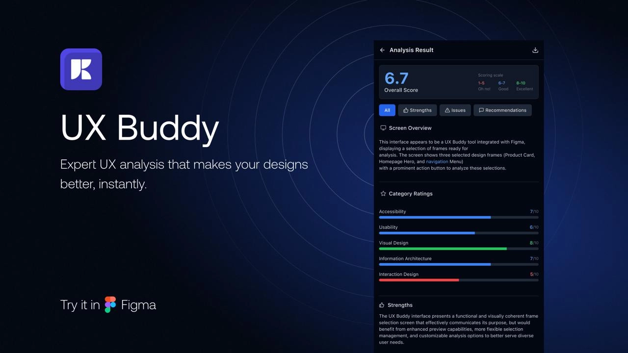
The problem: feedback shouldn’t require a meeting
Here’s a pattern every designer knows: you finish a screen, you’re reasonably happy with it, and then you wait. For your lead to look at it. For a stakeholder to weigh in. For the accessibility review to come back. The feedback, when it finally arrives, is often mechanical: spacing is off, that’s the wrong component, contrast fails AA, you forgot the loading state.
None of this required a human. It required a checklist with eyes.
I was tired of the cycle. So over 9 weekends in 2025, I built UX Buddy: a Figma plugin that gives you instant, expert-level design feedback without leaving your canvas. Select a frame, pick a critic, get a scored report with specific fixes — in seconds instead of days. No scheduling. No waiting. No “let me circle back on that.”
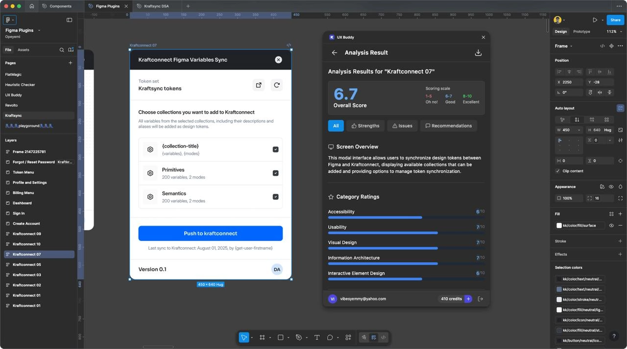
What I built: six critics, each with a point of view
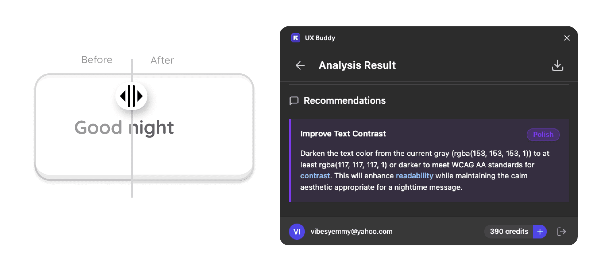
The mistake most design checkers make is generic feedback. “Improve visual hierarchy” means nothing. “Your CTA button at 44px should be 48px to meet WCAG touch target guidelines” is something you can fix before your next coffee.
I gave each critic a distinct voice and domain:
- Accessibility Auditor — contrast, touch targets, focus order, screen reader labels
- Visual Design Critic — color harmony, type scale, 8px grid, whitespace breathing room
- Usability Tester — cognitive load, affordance clarity, information density, error paths
- Interaction Design Reviewer — state coverage (hover, active, disabled, loading, empty), transition intent
- Design System Enforcer — component usage, variable binding, token consistency, detached instances
- Information Architect — content hierarchy, labeling, navigation logic, wayfinding
The breakthrough: why personas changed behavior
Here’s what I didn’t expect. The persona framing wasn’t just UX copy — it changed what designers fixed.
Beta testers who ignored the same spacing violation when a generic checker flagged it fixed it immediately when the “visual design critic” caught it. Calling it an “accessibility audit” made designers think about compliance. Calling it a “visual design critic” made them think about craft.
Designers don’t ignore feedback because it’s wrong. They ignore it when it doesn’t sound like it came from someone who understands the craft.
The insight that defined the product
This was the pivot moment. The plugin wasn’t a linter. It was a design partner with opinions. The names weren’t labels — they were personas, and that distinction changed the entire user experience.
Distribution was harder than building
The plugin worked. People used it. But getting those 122 users on the Figma Community took more effort than all 9 weekends of development combined.
Here’s something nobody tells you about shipping a marketplace plugin: the “Community” is a search engine, and you’re competing with thousands of other plugins for the same keywords. A good product with no visibility is invisible. I spent as much time on the listing page — description, screenshots, category tags — as I did on some features. The conversion from “found it” to “tried it” depended on things I hadn’t thought about as a designer: thumbnail resolution, first-sentence hook, whether the feature list scanned in under 5 seconds.
Platforms evolve. That’s not failure.
UX Buddy launched before Claude had native Figma integration and before Figma’s own AI features — Make Designs, Make Edits — started absorbing the space the plugin occupied.
When the platform builds what you built, two things are true at once: you read the gap correctly, and the window had a timestamp. This isn’t a postmortem. It’s a lesson in platform timing that applies to everything from Figma plugins to iOS apps to browser extensions. Build for the gap that exists today, but know that platforms fill their own gaps over time. The skills you build shipping into that window outlast the window itself.
What designers said
“I ran UX Buddy on a screen I thought was done. The design system enforcer flagged three detached instances and a hardcoded color. Fixed them in under a minute.”
“The accessibility auditor found contrast issues I’d been shipping for months. I didn’t know what I didn’t know.”
If I rebuilt it tomorrow
Ship with one critic, nail it, then expand. Six personas at launch was ambitious, but three got most of the usage. I’d launch with the accessibility auditor alone, prove the value, then add the design system enforcer and visual design critic based on actual demand.
Distribution is a feature, not an afterthought. I treated the Figma Community listing as a formality. It’s not. The description, screenshots, and search optimization are product work, not marketing. They determine whether anyone ever sees what you built.
Platform risk is real, but it’s also permission. The fact that Figma might eventually build your idea means you identified something real. That’s validation, not a reason to hold back. Build fast, learn faster, and treat every platform feature announcement as data about whether your thesis was right.
UX Buddy wasn’t a startup. It wasn’t a product I expected to maintain for years. It was an answer to a question I’d asked myself too many times: why am I waiting for a human to tell me my spacing is wrong? Nine weekends later, 122 designers had the same answer. The platform eventually caught up, but the product thinking I learned shipping into that window — about persona-driven design, marketplace distribution, and the lifecycle of platform-dependent tools — is what I carry into every project since.