Case Study · 2026
Lotti: AI-powered productivity that's honest, not aspirational
Redesigned an AI productivity app from technically complete to launch-ready. 3 milestones in 4 months — Lagos to Hamburg. 20+ configuration decisions collapsed to 3 presets. 3 overlapping organizational systems clarified into distinct interaction patterns.
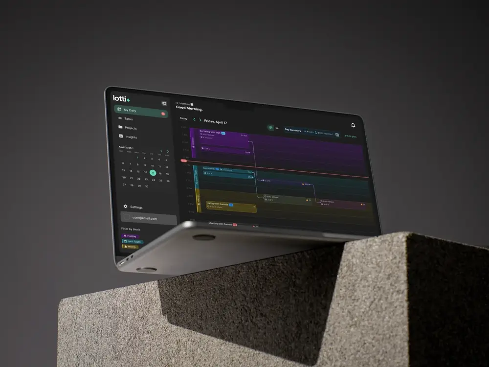
AI that remembers your day — even when it gets interrupted · iOS + Desktop · 3 milestones shipped
3,000 tasks. One user. An AI that could recall anything — but nobody else could turn it on.
The product was technically complete. Matthias had logged 3,000+ tasks across years of use: voice memos transcribed, screenshots analyzed, every session linked to context. The AI remembered what he was working on six months ago in seconds. But the interface had three overlapping organizational systems, a timeline that treated every interruption as failure, and an AI configuration screen with 20+ raw checkboxes. No onboarding. No design system. No launch.
For someone with memory-related conditions, “what did I do yesterday” isn’t convenience — it’s survival. That’s why Matthias’s therapist friend kept asking why the product wasn’t out yet. The answer: a technically complete product that was unusable for anyone who wasn’t the founder.
I joined as the freelance senior designer — Lagos to Hamburg, cold referral, three milestones. Feb to May 2026.
What was broken
I ran a full UI audit across every screen before touching anything. Matthias walked me through the product over several calls, and a pattern emerged: every time he had to explain how to do something rather than why you’d want to, that was a design problem.
Three stood out.
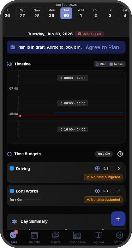
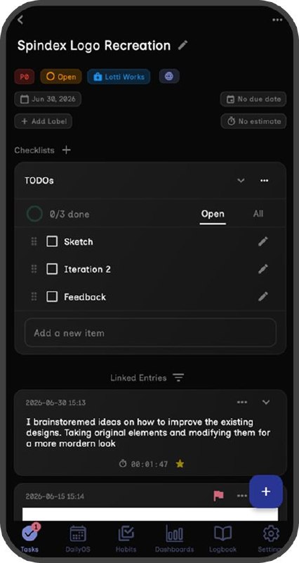
Categories, Labels, and Tags were fighting for the same job. Matthias paused mid-sentence trying to explain when to use which. Categories were required for task creation. Labels were optional status markers. Tags were freeform hashtags. Functionally distinct, but the interface presented them as peers with no hierarchy. If the person who built it couldn’t explain it cleanly, a new user had no chance.
My Daily punished real work. The flagship timeline showed planned time blocks as rigid containers. Tasks that started early, ran late, or resumed after interruption were treated as deviations. But Matthias’s own data showed fragmented work was the norm, not the exception. The interface was telling a lie about how work happens.
The AI was powerful and hidden. Task summaries, a conversational agent scoped to each task, automatic transcription from voice notes, screenshot analysis tied to task context. All working. But the configuration screen was a wall of checkboxes with no presets and no explanations.
The product had depth. It just had no surface.
📷 Image placeholder
Grid of original Lotti mobile screens before redesign — 6-8 screens arranged in a clean grid showing: dense task list, confusing taxonomy picker, rigid timeline view, checkbox-wall AI config, missing onboarding flow, and cluttered task detail.
Caption: The full mobile screen inventory before the redesign — dense layouts, no onboarding flow, overlapping information architectures.
Categories, Labels, Tags: three systems, three jobs
Merging them was tempting. The source material even suggested it. But they served genuinely different purposes, and collapsing them would lose useful structure.
The real problem was that nothing in the interface communicated the differences. So I gave each a clear, non-overlapping job and designed the interactions to match.
📷 Image placeholder
Side-by-side comparison — LEFT: original interface with three indistinguishable taxonomies (Categories, Labels, Tags presented as identical dropdowns). RIGHT: redesigned version with distinct interaction patterns: a picker for Categories (one, required), toggle chips for Labels (structured), and a freeform type-ahead for Tags (emergent).
Caption: Before and after — three organizational systems, three distinct interaction patterns: pick, toggle, type.
- Categories (one, required): primary organizing structure. “Lotti Works,” “Personal,” “Driving.” Carries AI settings, color, and icon. The backbone. You pick from a defined list.
- Labels (multiple, optional, structured): workflow status markers scoped to a category. “Bug,” “Urgent,” “Waiting.” Finite set, intentional. You toggle from a scoped set.
- Tags (multiple, optional, freeform): emergent taxonomy. #topic, @person, #story-thread. Grows with the user. You type freely.
The interaction design did the teaching. Pick, toggle, type. Three different inputs for three different mental models. Matthias stopped pausing mid-sentence when he saw it. You don’t need a tutorial when the interface already explains itself.
My Daily: the honest timeline
This was the centerpiece. If Lotti remembered your day, My Daily was its visual memory. It needed to tell the truth.
Before: time blocks as rigid containers. A task worked on outside its block was an error.
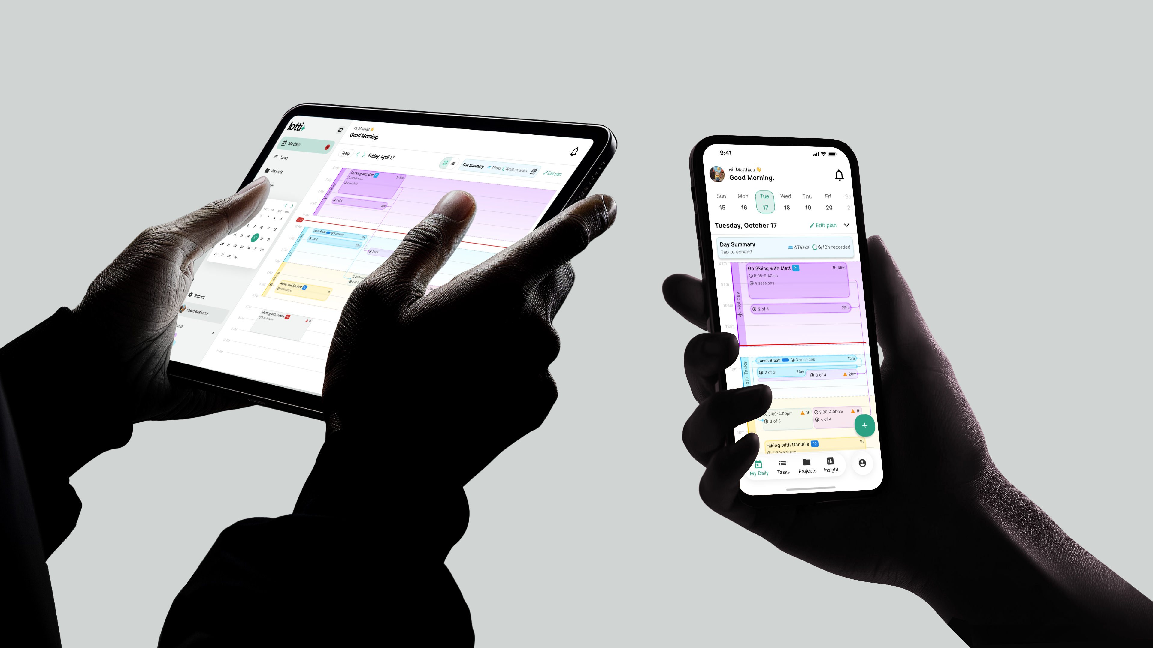
After: time blocks render as background context, colored vertical bars showing planned focus periods. Task cards render at their actual work times. Tasks inside their matching block show full opacity. Tasks outside their planned block fade to 50–60%. Not an error. Just information.
The moment Matthias understood this was the moment the project shifted from audit to redesign. He had been living with an interface that subtly shamed him every day for being interrupted. The fade states said “this wasn’t the plan” without any of the judgment.
Multi-session tasks got particular attention. Real work doesn’t happen in unbroken focus. You start, get pulled away, return, get interrupted again. Lotti tracks each session individually and links them with curved connecting lines. The first card shows full task info and a session count. Continuation cards show just enough to orient you.
This was the core design bet: honest tracking, not aspirational tracking. Most tools punish you for having a fragmented day. Lotti just shows you what happened.
📷 Image placeholder
Full-width screenshot of the redesigned My Daily timeline. Colored vertical bars in the background represent planned time blocks. Task cards appear at their actual work times — some aligned with blocks (full opacity), others outside blocks (50-60% faded). Multi-session tasks show curved connecting lines between sessions, with the first card showing full task info + session count and continuation cards showing just enough to orient.
Caption: The honest timeline — planned time blocks render as background context (colored bars), actual task cards appear at real work times. Cards fade to 50-60% opacity when they fall outside their planned block — not an error, just reality.
AI without the checkbox wall
The AI was genuinely good. Per-task summaries with structured output: TLDR, Goal, Achieved, Remaining, Learnings. A conversational agent that could reorder your remaining steps on request. Transcription from voice notes. Screenshot analysis.
But the configuration screen was killing it. Twenty-plus raw checkboxes. No grouping. No explanation of what enabling each one would actually do.
I restructured it into progressive disclosure:
- Three quick presets at the top: Minimal, Balanced, Maximum. One tap.
- Custom configuration collapsed below, toggles grouped under clear functional headings
- Plain-language explanations for each toggle: what it does and when you’d want it
Same power. Same individual controls. But now a new user could go from zero to configured in one tap instead of 20 decisions.
📷 Image placeholder
Desktop screens showing the redesigned AI configuration. TOP: the three-preset selector (Minimal / Balanced / Maximum) with the Maximum option highlighted. BELOW: custom configuration toggles collapsed under grouped functional headings with plain-language explanations for each toggle. Side-by-side inset showing the same configuration screen before (20+ raw checkboxes with no grouping) and after (progressive disclosure with presets).
Caption: Desktop screens — the AI configuration panel before and after. 20+ checkboxes became 3 presets with progressive disclosure.
Three takes on a health score
Mid-engagement, a design question surfaced: how do you communicate “is this task on track?” as a single glanceable indicator?
I designed three complete directions:
- Action-focused — circular progress ring, status callout, one named blocker action. “Here’s the thing to fix.”
- Metric dashboard — large score plus sparkline trend, 2×2 status grid. More data, more cognitive load.
- Status-first — top banner leading with the blocker, score demoted. Good for urgency, weaker for scanning.
Instead of presenting static mockups, I built an interactive HTML comparison with live data so Matthias could swipe between all three. The decision took one call instead of three rounds of Figma revisions. He chose the action-focused direction.
This was the kind of problem his therapist friend had been thinking about. For someone with memory-related challenges, a health score isn’t a productivity metric. It’s a signal: “here’s what needs attention, and here’s the one thing to do about it.” The action-focused direction served both power users and the accessibility use case without compromise.
📷 Image placeholder
Three health score card designs presented side-by-side in device mockups: (1) Action-focused — circular progress ring, status callout, one named blocker action (“Here’s the thing to fix”). (2) Metric dashboard — large score plus sparkline trend, 2x2 status grid with more data. (3) Status-first — top banner leading with the blocker, score demoted. The action-focused variant should be visually highlighted (subtle glow or accent border) as the selected direction.
Caption: Three Health Score directions explored — action-focused, metric dashboard, and status-first. The action-focused direction was chosen; it served power users and the accessibility use case without compromise.
What shipped
- Comprehensive UI audit: 3 critical findings clustered by impact across all screens
- My Daily timeline redesigned: interruption-aware tracking with linked multi-session cards
- Task Detail screen with collapsible AI summaries and session-level time tracking
- Lotti Agent conversational AI interface, scoped per task
- Time Block Planning flow refactored for clarity
- Health Score Card: 3 directions explored, interactive comparison delivered in 1 call
- Complete notification copy system: 6 categories, tone guidelines, priority framework
- Multiple empty-state scenarios including a voice-first “Tell me your plans” entry point
- Design system starter spec: color, type, spacing, component inventory
- Full information architecture documentation
3 milestones. 4 months. All delivered. Matthias is preparing for public launch. The product went from technically complete to launch-ready — 20+ configuration decisions became 3 presets, 3 overlapping systems became 3 distinct interaction patterns, and a timeline that punished real work now just shows what happened.
📷 Image placeholder
Horizontal scroll or grid of the full shipped mobile flow — 5-7 screens showing the complete user journey in logical order: (1) onboarding — voice-first “Tell me your plans” empty state, (2) dashboard with honest timeline, (3) task detail with collapsible AI summaries and session tracking, (4) category/label/tag interaction showing pick/toggle/type distinction, (5) Lotti Agent conversational AI interface scoped to a task, (6) settings and AI configuration with presets. Screens arranged left-to-right with subtle connecting arrows or numbered steps indicating flow.
Caption: The full shipped mobile flow — onboarding to daily use, designed across 3 milestones from Lagos to Hamburg.
What I’d rethink
Sample size of one. Matthias had 3,000+ tasks of personal usage data, invaluable for understanding the product’s behavior. But he was also the only user. He had learned to work around interface issues that would block a new user cold. Even three external beta testers during the audit phase would have surfaced patterns the founder’s muscle memory had absorbed. Now on every project, I recruit 3–5 external testers during the audit phase — not for statistical significance, but to catch the things the builder can’t see.
Prototype the hard UI earlier. The Health Score comparison was effective but came late. If I’d prototyped it during Phase 1, the decision would have been baked into the Phase 2 timeline work rather than retrofitted. When you know a UI problem has multiple valid answers, don’t wait to test them. Now I prototype comparison interfaces the moment a divergent design question surfaces — the interactive HTML approach that worked here has become my default for multi-option decisions.
The product was technically complete before I started. The design made it usable — not just for the person who built it, but for everyone he hoped to reach: the person who gets interrupted, the person who can’t remember which taxonomy does what, and maybe someday, the person who genuinely needs help remembering what they did yesterday. That’s the difference between a technically complete product and a launch-ready one. Not polish. Access.