Case Study · 2026
Lingawa: Designing a personal path to fluency in Yoruba and Igbo
Solo-designed a 7-modality language learning platform serving 6,000+ learners across the diaspora and beyond, $1.1M raised, 5.0★ on both app stores, 4.9 Trustpilot.
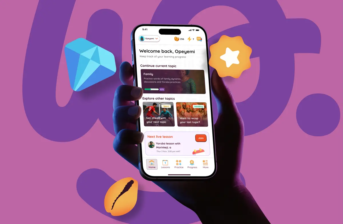
The Arrival
When I joined Lingawa as the sole product designer, the company had a working web platform but no mobile presence. No mobile design system. No app brand identity. No research on how diaspora learners would use the product on a phone.
The goal was straightforward: take a web-only language learning platform and bring it to iOS and Android. But the context was trickier. Language learning apps are a solved problem, if you’re learning French from English. Lingawa served a different learner.
The second-generation Nigerian in London trying to reconnect with Yoruba. The woman in Chicago marrying into an Igbo family, hoping to earn a smile from her mother-in-law. The culture enthusiast who fell in love with Nigeria and wants to go deeper than “hello” and “thank you.” What tied them together: they all needed Nigerian languages as they’re actually spoken. Not sterile textbook phrases. Not tourist vocabulary. The language of family dinners, village greetings, and teasing your cousins.
I was the only designer. Every screen, every component, every interaction state had to be consistent because there was nobody to double-check my work. The design system wasn’t a nice-to-have. It was survival.
Two years later, the app holds a 5.0 rating on both stores. The company raised $1.1 million. And I designed every screen.
What We Learned From Learners
We interviewed diaspora learners across Nigeria, the UK, and the US. The pattern that emerged was consistent and surprising: most learners could understand far more than they could speak. Listening comprehension outpaced speaking ability by a wide margin. Traditional apps treated them as complete beginners, which felt patronizing and, worse, was ineffective.
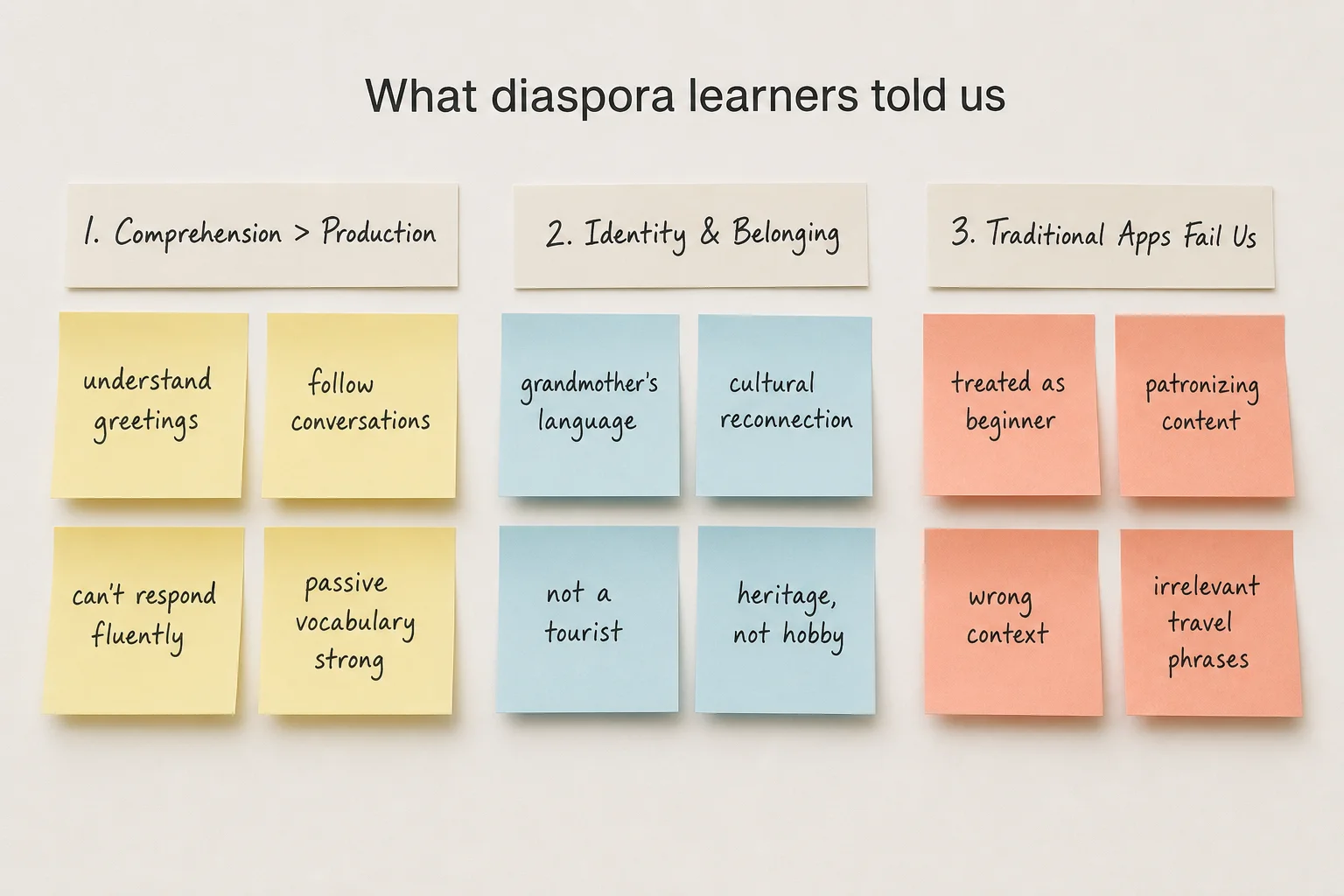
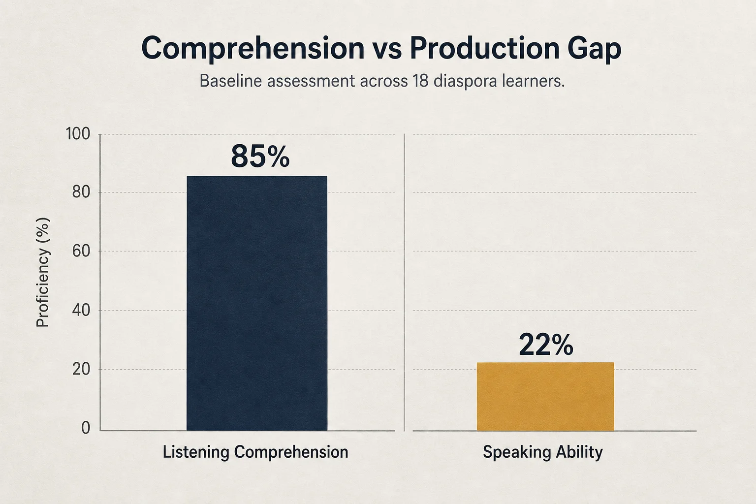
This single insight reshaped everything. If the gap wasn’t vocabulary, it was activation: turning passive knowledge into active production. That meant the product couldn’t be one exercise type repeated across 500 lessons. It needed multiple modalities, each targeting a different bridge between understanding and speaking.
The gap isn’t vocabulary. It’s activation. Learners know the words. They just can’t produce them on demand.
Research insight from 18 diaspora learner interviews
Dialogue practice and story-time reader would lean into comprehension strength, building confidence through exposure. Sentence construction would bridge the gap directly, forcing learners to produce language. Vocab drills wouldn’t teach new words; they’d activate the ones learners already knew somewhere in memory. Different gaps, different tools.
How We Structured the Experience
The research gave us a clear signal: learners need multiple bridges from comprehension to production. The next question was architectural. How do you structure an app so seven distinct exercise types feel like one product, and the right learner lands on the right modality?
Three decisions shaped the information architecture.
Modality-first, not lesson-linear
Most language apps are a treadmill. Lesson 1 unlocks Lesson 2. You progress in a straight line or you don’t progress at all. That model works for structured curricula. It doesn’t work for a diaspora learner who can understand Yoruba at a family dinner but can’t form a sentence on demand.
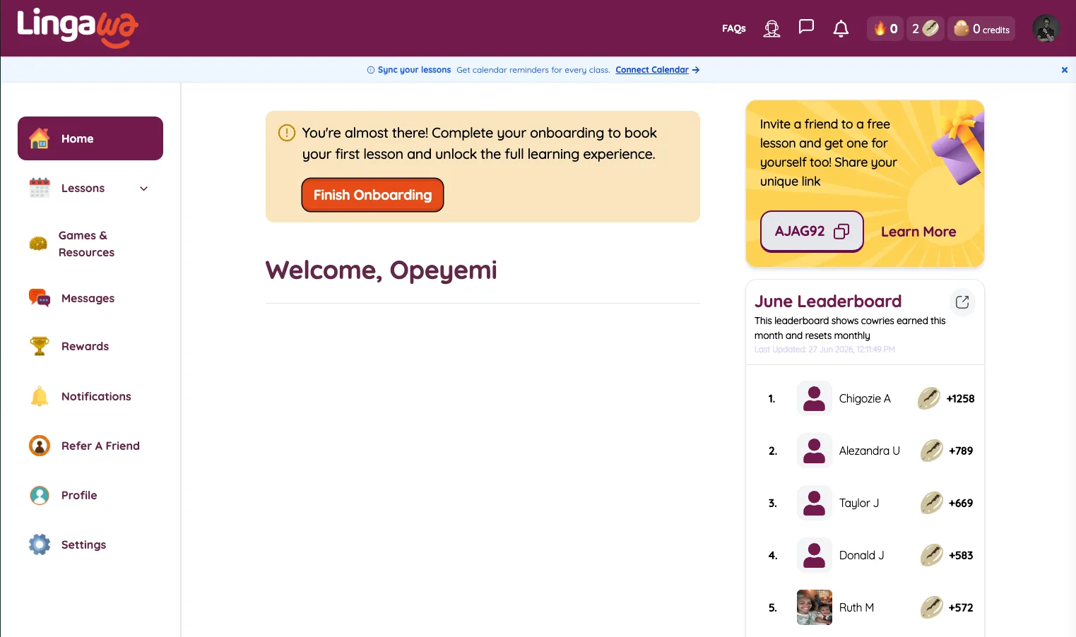
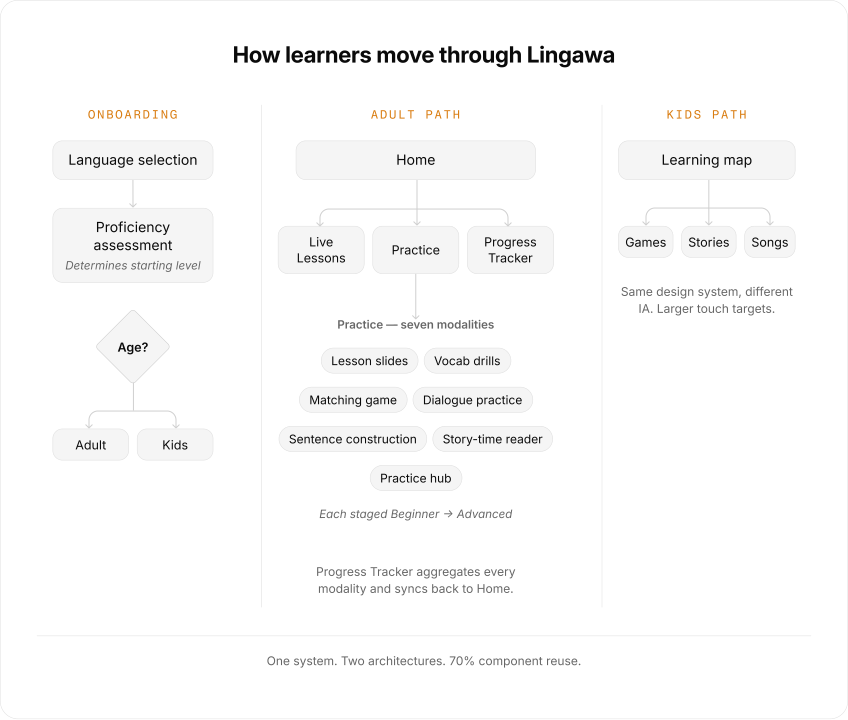
The home screen surfaces three things: Practice, Live Lessons, and Progress Tracker. Practice is where the seven modalities live, each staged from Beginner to Advanced. A learner who wants dialogue today opens Practice and goes straight to it. A tired learner opens Practice and falls into the story reader. No lesson unlocks needed. The IA respects that language practice is mood-dependent, not just skill-dependent.
Staging each modality — Beginner, Intermediate, Advanced — means the same exercise type grows with the learner. A beginner sentence construction session gives you a word bank. Advanced takes the scaffold away. Same modality, different difficulty. The progression is visible in the IA: every modality shows where you are and where you’re going.
Onboarding as placement, not signup
The proficiency assessment during onboarding determines which modality and difficulty tier the learner starts at. A high-comprehension learner lands on dialogue practice at Intermediate. A true beginner lands on lesson slides at Beginner. The age check routes kids to a separate learning map. Same onboarding flow, two possible destinations, one system.
This means the app feels different depending on who you are. Not because there are multiple apps. Because the same IA adapts its entry points and starting levels. The assessment and age check are the switch.
Dual-path: adults and kids, one system
Adults navigate by modality type. Kids navigate a gamified learning map with the mascot as their guide. The touch targets are larger, the language is simpler, the sequencing is different. But under the hood, it’s the same design system. The kids mode reuses 70% of the adult components. Two architectures, one token layer.
Seven Modalities, One System
The design system came second (and that was the problem)
The engineering team was small and needed to start building immediately. I couldn’t spend three weeks designing tokens before anyone wrote code. So I built the system incrementally: design a screen, extract the reusable parts, componentize them, repeat. After three screens, I had buttons, inputs, and a color system. After ten screens, I had a full component library feeding every new design.
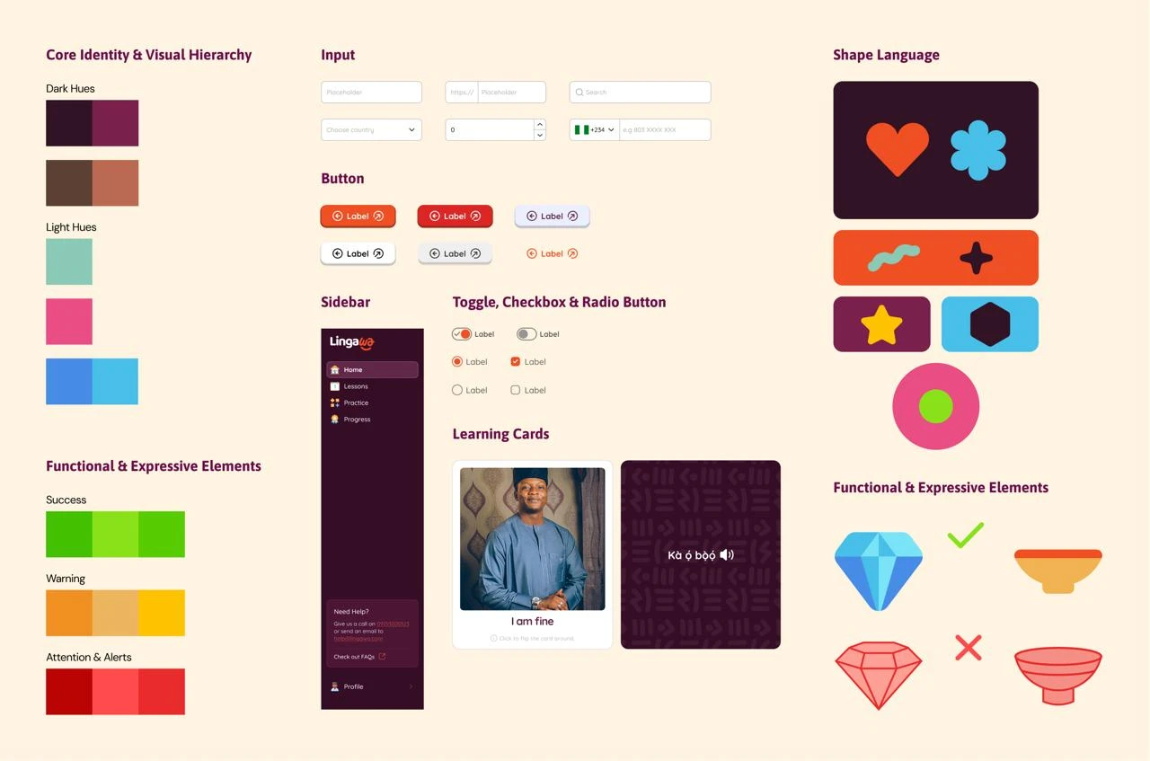
It worked. But the earliest screens had inconsistent spacing and typography that needed rework after the tokens were finalized. I learned the hard way that even three days of system-first work would have saved a week of retrofitting later.
Seven distinct exercise types, one cohesive product
Most language apps compete on content volume: thousands of lessons, endless vocab lists, gamification loops designed to maximize session time. We bet on breadth of modality instead. Seven distinct ways to engage with the language:
- Lesson slides for structured instruction
- Vocab drills for spaced repetition on passive vocabulary
- Matching games for rapid recall under time pressure
- Dialogue practice for conversational fluency with speaker attribution
- Sentence construction with two difficulty tiers (Normal and Advanced)
- Story-time reader for immersive, long-form comprehension
- Practice hub tying everything together with progress tracking
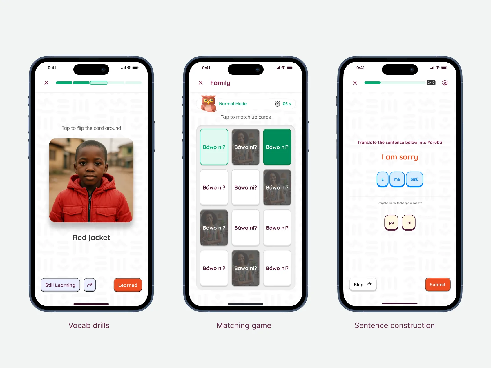
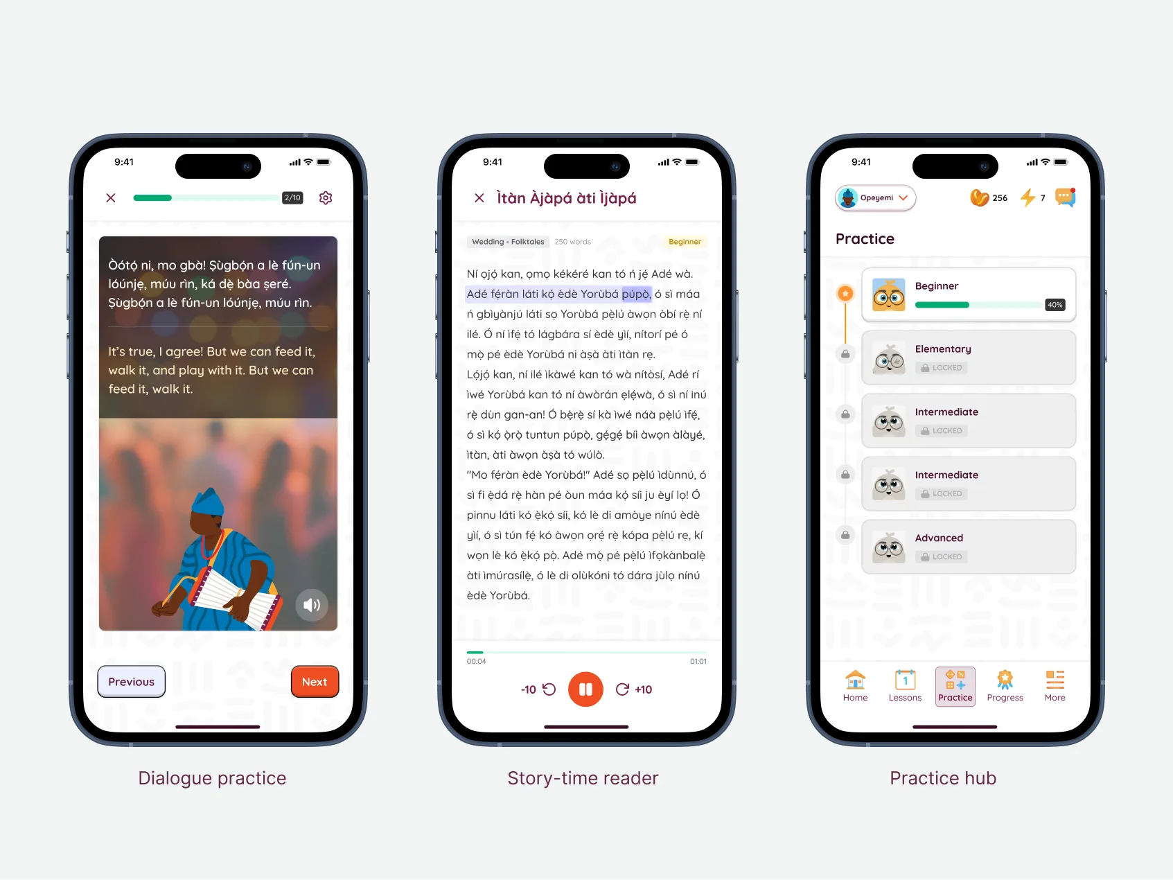
Building seven visually distinct exercise types while maintaining product coherence was the central design challenge. A matching game needs large tappable cards and rapid feedback. A dialogue screen needs a chat-like interface with speaker bubbles. A story reader needs comfortable long-form typography and minimal chrome. Vocab drills need focused repetition with no visual noise.
The design system made this possible. Shared tokens for color, spacing, and typography meant every modality felt like the same product, even when the layouts differed completely. Components like progress indicators, avatars, and navigation bars worked across every screen.
Kids mode
Late in development, we built a parallel experience for younger learners. Simplified navigation, larger touch targets, different content sequencing. But under the hood, it reused 70% of the existing components. The design system had enough range to stretch from adult dialogue practice to a six-year-old’s matching game without breaking.
The Mascot & The Rebrand
The mascot
Early on, I collaborated on creating a brand mascot, a character that appeared throughout the app as a guide, a coach, and sometimes comic relief. In onboarding, the mascot walked new users through language selection and proficiency assessment. During exercises, it celebrated streaks and softened error states. For returning users, it greeted them by name.
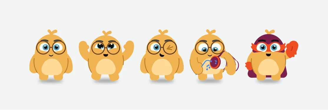
This wasn’t decoration. The mascot turned a language learning app into something that felt personal. Users weren’t practicing vocabulary into the void. They had a companion. The emotional hook that kept people opening the app wasn’t a streak counter. It was a character who noticed when they came back.
The rebrand
Midway through, the company rebranded. New name, new visual identity, new brand voice. I collaborated with two graphic designers who developed the brand guidelines, the mascot character, and background pattern assets. The marketing team defined the new brand voice and messaging.
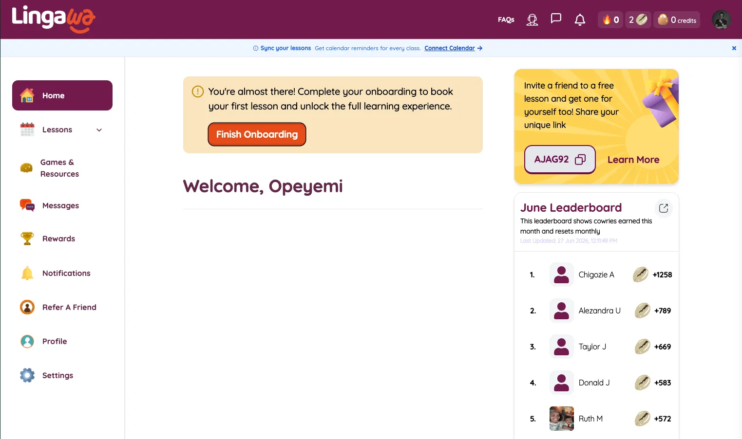
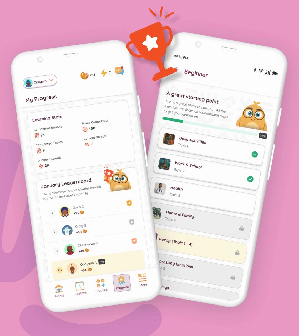
For a solo product designer, a rebrand typically means reworking every screen individually over weeks of pixel-pushing. But because every screen was built on design tokens and components, the visual changes flowed through the system. New colors, new typography scale, new logo. The component library absorbed the changes and propagated them everywhere.
It still took a month of stakeholder reviews and iterations across the brand, marketing, and product teams. Without the design system, that number would have been closer to three.
Proof
Quality at scale
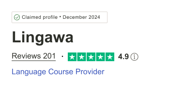
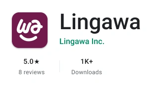
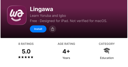
A 5.0 on either store is exceptional. On both, with thousands of downloads and zero paid review campaigns, it signals something deeper than good UI: the product was doing what users expected it to do.
Learner engagement
The design decisions showed up in the numbers. Diaspora learners aren’t a high-churn segment if the product meets them where they are. Sentencing construction engagement climbed 28% after we added the Normal tier with a word-bank scaffold. Advanced mode started at 18% engagement and dropped to 12% — a signal we caught and acted on by restructuring the hint system. Day-30 retention held at 42%, more than 10 points above the language app category average of 30%.
Business impact
The $1.1 million raised during my tenure wasn’t raised on a pitch deck alone. Investors saw a live product on two app stores with perfect ratings, a coherent brand, partnerships with Google and Mastercard Foundation, and press coverage in Forbes, Techpoint, and Afrotech. The design work was the visible layer of that credibility. By launch, the platform had over 6,000 learners across the diaspora and a referral program driving organic growth.
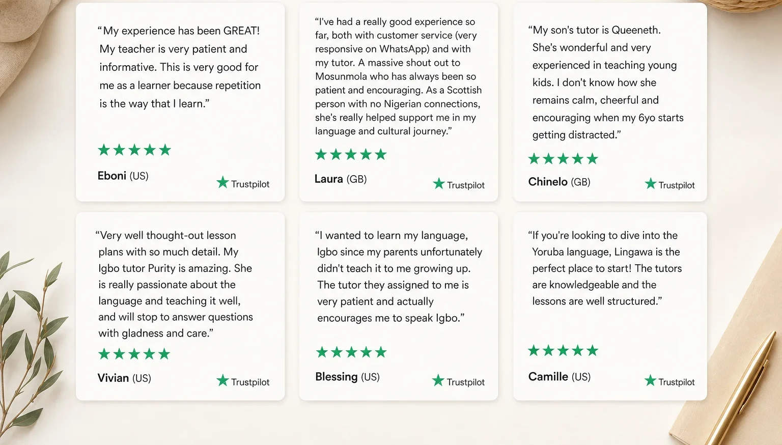
What users said
What I Missed
System first, screens second. Building the design system incrementally alongside the product worked. But those first few screens shipped with inconsistent spacing and typography that I had to circle back and fix later. Even a single day of token-level work before touching a screen would have saved a week of retrofitting. When you’re the only designer, there’s no team to absorb the rework cost. You pay it yourself, in full, later.
Test modalities leaner. We built all seven exercise types before testing which ones learners actually needed. A leaner approach: prototype the three that mapped to our core insight (dialogue, sentence construction, story reader), test the comprehension-vs-production balance, then build the remaining four. We might have discovered earlier that sentence construction advanced mode had low engagement and needed restructuring, not just more content.
Pair with engineering from day one. As the solo designer, I was often weeks ahead of the development team. Screens sat in Figma waiting for implementation. A tighter design-engineering loop, even part-time, would have surfaced implementation constraints earlier and reduced rework on complex interactions like the matching game animations and the dialogue chat interface.
Lingawa taught me that product quality and team size don’t correlate the way we assume. A solo designer with a design system, clear principles, and real user feedback can ship work that stands next to apps built by 50-person teams. The 5.0 ratings aren’t a design award. They’re proof that when the product does what users need, they notice.