Case Study · 2026
Gangan: A music platform where artists get paid, not played
Solo-designed a direct-to-artist music subscription platform across web, iOS, and Android. Design system powering dual-persona experience (Fan + Artist), brand identity, and logo. No algorithm. No middleman.
Open Gangan ↗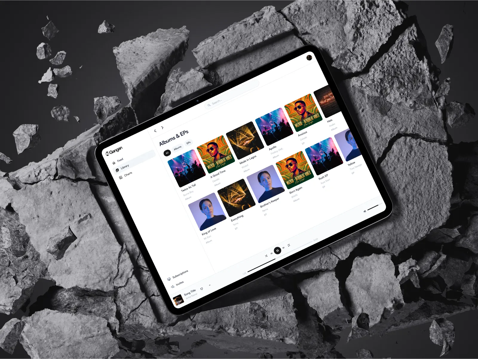
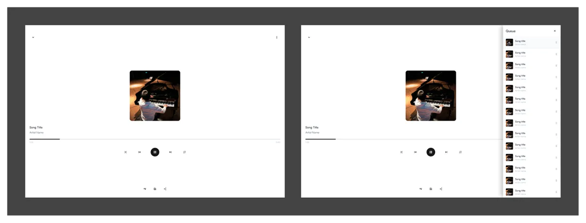
Solo designer. Four platforms. Zero algorithm. · 2 people. 1 design system. 0 design-build discrepancies. · Live on iOS, Android, and web · Launched May 2026
The Problem
Spotify pays artists fractions of a cent per stream. Industry estimates put it at $0.003 to $0.005. You need roughly 250,000 monthly streams to hit minimum wage. The algorithm surfaces whoever keeps users on-platform longest. Playlist gatekeepers decide who gets heard. Artists build the audience — on stage, on social media, in their local scene — then hand most of the revenue to a platform that didn’t build any of it.
Gangan inverts the model. Artists set their own subscription tiers and prices. Fans subscribe directly. The money goes straight to the artist. No mystery math. No middleman.
I joined as the solo designer. The brief: website, web app, iOS, Android, a design system to hold it all together, the logo, and the brand. One developer, Thompson Edolo, handling all of engineering. Two people. Four platforms. Early 2026.
What We Discovered
Before touching a single screen, I needed to understand who we were designing for. Two groups, completely different relationships to music.
Artists didn’t want another dashboard. Every existing tool treated them like content factories — upload more, post more, optimize for the algorithm. When I talked to independent artists during the research phase, the frustration was consistent: “I already know my fans. I just can’t get paid by them directly.” They didn’t need discovery. They needed a business.
Fans wanted access, not recommendations. The people who support independent artists aren’t casual listeners. They’re day-one supporters. They want early access, subscriber-only tracks, rough cuts, voice notes — the things that make them feel connected to the artist, not algorithmically matched to a genre. They already knew who they loved. They just couldn’t subscribe to them the way they subscribed to a newsletter or a Patreon creator.
The insight that shaped everything: both groups already had the relationship. The product just needed to facilitate the transaction. We weren’t building discovery. We weren’t building algorithmic recommendation. We were building a direct payment rail between people who already wanted to support each other.
The Breakthrough
The dual-persona architecture clicked during a whiteboard session with Thompson. We were mapping navigation structures — Fan sees feed, library, charts, search. Artist sees dashboard, upload, earnings, fans. Completely different information architectures. Completely different mental models.
Thompson said: “So we’re building two apps that share a player.”
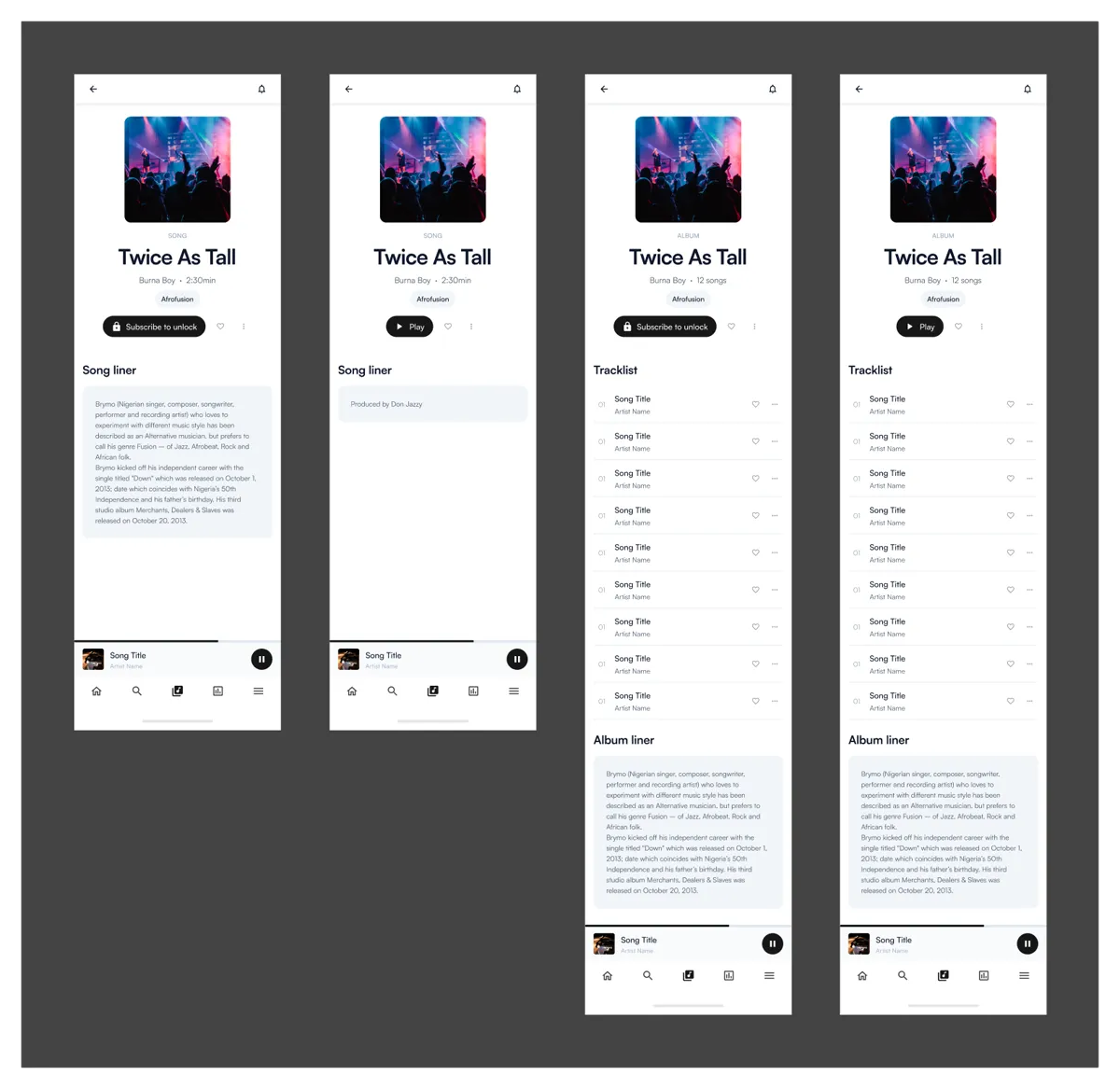
He was right. And wrong. Two apps, yes. But if we designed them as separate products, we’d spend the entire project duplicating work. The breakthrough was realizing that the components could be the same while the layouts and navigation trees differed entirely. A Card component renders a song in the Fan feed and a release in the Artist catalog. Same skeleton. Different data. Same visual language. Different context.
This became the design system’s reason for existing. Not consistency for its own sake. Survival. With one designer and one developer, we couldn’t afford to design anything twice.
How We Built It
The design system came first
I learned this the hard way on a previous project, where I designed screens before the system and spent a week retrofitting spacing and typography later. Not this time. Before designing a single screen, I spent the first week on tokens: color, typography, spacing, elevation. Dark-first palette anchored in deep indigo. Single type family across all platforms. 4px base grid. Three elevation levels: surface, overlay, player.

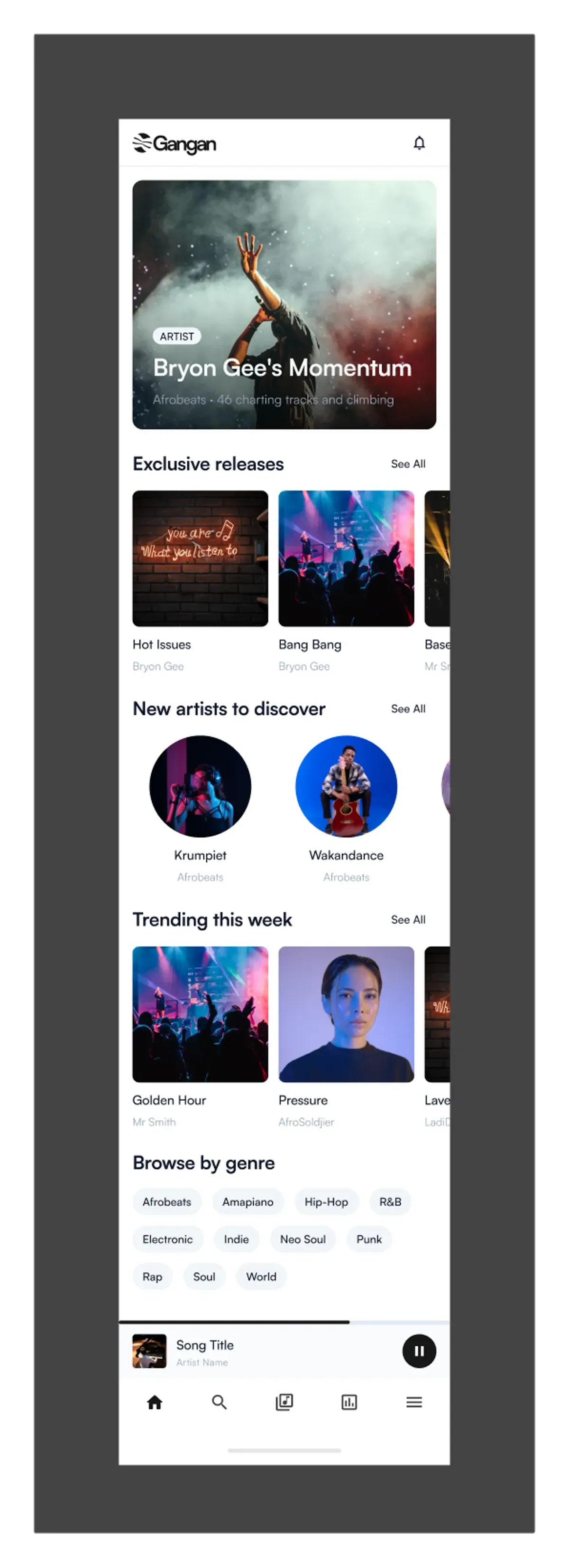
The component system grew organically from there. Every time Thompson needed to build something, the component already existed in Figma with clear variant structure. The Card component had states for song, artist, subscription tier, and release. The Navigation component shifted structure between Fan and Artist contexts while keeping the same visual DNA.
I won’t list every component. What mattered was that the system answered the only question that mattered: can we build once and deploy everywhere?
Tier pricing: the hardest UI on the platform
An artist sets up to three subscription tiers. Each has a name, a price, and a description. This is their business model. Not a settings field.
The first version was a standard form: three text inputs, three price fields, done. Clean. Efficient. Completely wrong. Artists treated it like paperwork. They filled it out as fast as possible and moved on.
The problem was that an empty form doesn’t communicate stakes. An artist setting a $2 tier vs a $10 tier isn’t picking a number — they’re defining what their work is worth. The interface needed to make that visible.

The second version added live preview cards. As you type a tier name and price, a preview renders exactly what fans will see. Earnings projections update in real time: “50 fans at $5/month = $250/month.” Suddenly artists slowed down. They thought about their pricing. The form became a decision tool, not a data entry task.
This iteration — from efficient form to guided experience — came directly from watching Thompson test the first version internally. He set up a tier in 15 seconds and said, “That felt too easy. Shouldn’t I think about this more?” He was right. Efficiency was the wrong goal for a pricing decision.
Working with one developer
Thompson and I developed a rhythm. I’d design a screen family in Figma, he’d build it, we’d review the live build together, and I’d update the design file to match what actually shipped. Not because the build was wrong — because implementation always surfaces things Figma can’t.
The mini-player was supposed to persist across navigation with a smooth expand animation. In Figma, that’s two frames and a prototype link. In code, it’s a shared component with gesture handling, audio state, and route awareness. Thompson built it in three days. I updated the design file to reflect the actual interaction model — the Figma prototype was aspirational, the live build was real.
“Opeyemi didn’t hand off designs and disappear. We reviewed every build together. When something in the code surfaced a better interaction than what was in Figma, he updated the design file — no ego about it. That loop meant we shipped with zero discrepancies between design and build. I’ve never had that on a project before.” — Thompson Edolo, Lead Developer
This loop — design, build, review, update — meant the Figma file was always the source of truth, not a frozen ideal that engineering had to chase. By launch, there were zero “the design file says X but the build does Y” discrepancies. Because I updated the design file every time the build taught us something.


What Shipped
Gangan launched May 2026 on web, iOS, and Android. The product is live — artists are setting tiers, fans are subscribing. Early adoption data is still emerging and this page will be updated as the platform finds its first audience. Here’s what shipped:
- Design system powering all four platforms
- Fan experience: feed, library, charts, search, subscriptions, full-screen player
- Artist experience: dashboard, earnings, fan analytics, upload flow, tier management
- Subscription tier architecture with guided pricing and live previews
- Full-screen music player with lyrics, queue, and playback
- Upload flow for singles and albums with cover art and release scheduling
- Logo and brand identity (talking drum symbol in three configurations)

The name Gangan comes from the gángan — the Yoruba talking drum. An instrument that doesn’t just play rhythm. It speaks. It mimics the tones of the Yoruba language, carrying meaning across distance. The logo is a silhouette of that drum, reduced to essential geometry. The wordmark sits alongside in a clean, modern typeface. Direct communication, nothing lost in translation — that’s the product thesis, and it’s in the mark itself.
- Social media templates and app store assets
- Marketing website (gangan.app)
All designed solo. All built with one developer.
What I’d Rethink
The Fan feed starts cold. For a new user with zero subscriptions, the feed is an empty page. We debated pre-populating it with trending content or genre-based suggestions, but the philosophy was “only show what the user chooses.” That’s principled. It’s also a cold start. A lightweight onboarding that lets users pick 3–5 genres and immediately shows relevant artists would turn a blank page into a discovery moment without compromising the philosophy.
Artist tier setup could educate more. The second version of the tier UI was a genuine improvement — live previews, earnings projections, artists slowing down to think. But we stopped short of full guidance. What do successful artists in similar genres charge? What’s the conversion rate from free tier to paid? A “smart defaults” option based on audience size and genre would help artists who’ve never monetized before. The tool is powerful. The strategy is still on the artist. A little more scaffolding at the critical moment wouldn’t hurt.
Document the system for the developer. I built the design system in Figma with clear naming and variant structure. Every component was self-documenting in context. But Thompson still had to ask “what’s the hover state on this button?” and I’d send him a Figma link. Over the course of the project, those cumulative context-switches added up. A single-page token reference and component spec would have saved us both hours. Next time, documentation ships alongside the first component.
This project taught me something I’d suspected but never proven: a solo designer and a single developer can ship a four-platform product with a design system, a brand, and a coherent UX — if the system does the heavy lifting. We didn’t have a team. We had a design system, clear principles, and a tight design-engineering loop. That was enough.