Brand Identity · 2026
Gangan: Brand Identity
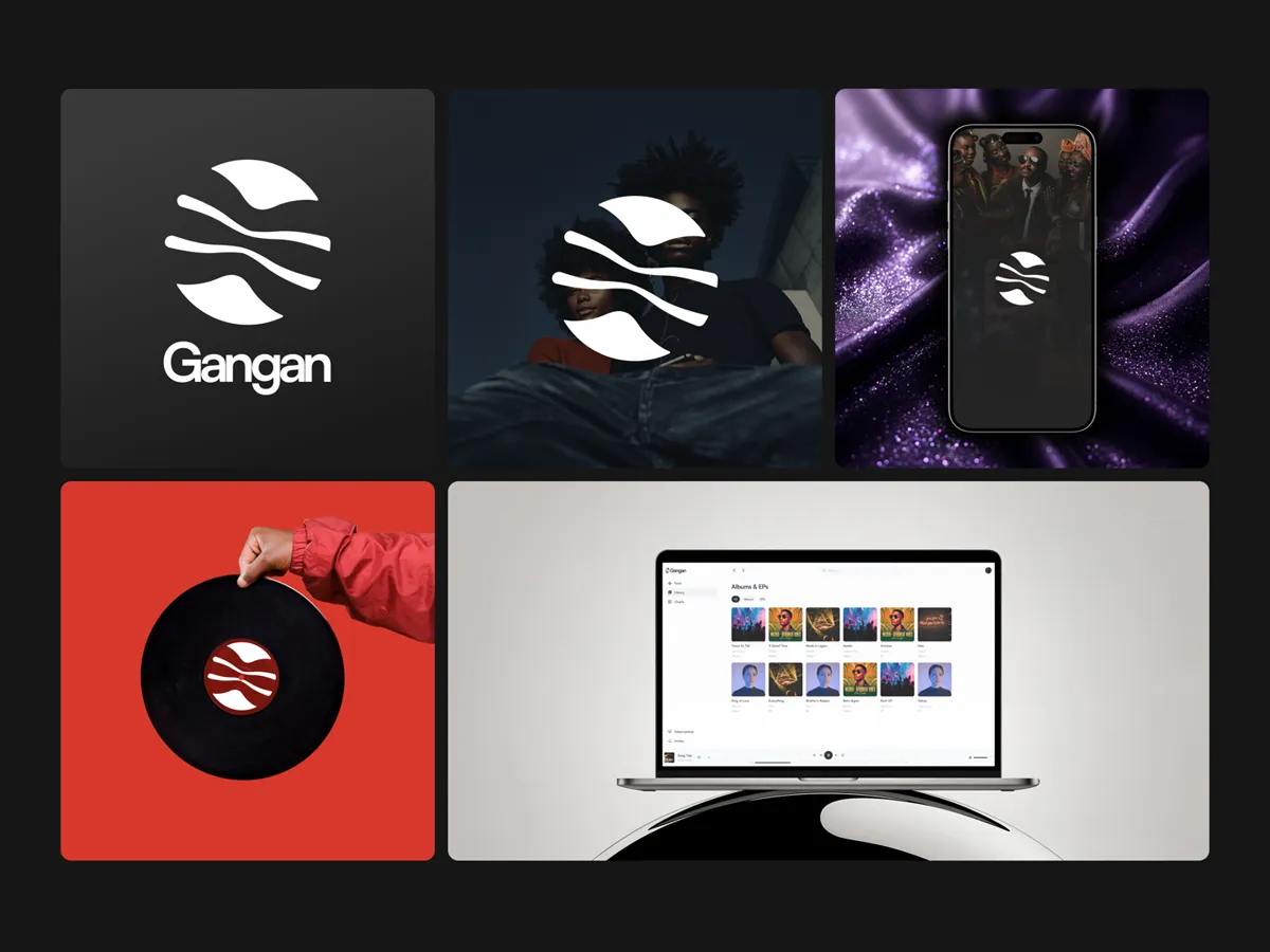
A talking-drum silhouette and visual identity for a music platform built on direct artist-to-fan economics. No algorithm. No middleman. Just the mark.
Introduction
Gangan is a music platform where artists set their own subscription tiers and fans subscribe directly. No algorithm deciding who gets heard. No middleman taking a cut.
The name comes from the gángan, the Yoruba talking drum. An instrument that doesn’t just play rhythm. It speaks. It mimics the tones and cadences of the Yoruba language, carrying meaning across distance. That’s what the platform does: it carries value directly from fan to artist, with nothing lost in translation.
The logo is a silhouette of that drum. Not an abstraction. Not a metaphor. The thing itself.
Challenge
The primary challenge was to visually define a platform that rejects everything about the streaming industry. Spotify is green, algorithmic, corporate. Apple Music is red, curated, walled-garden. Gangan needed an identity that felt independent, direct, and unmistakably music-first, without looking like a startup that tried too hard.
The brand had to work across four platforms (web, iOS, Android, marketing site) and two completely different audiences: artists running a business and fans discovering music. Same mark. Different contexts. No confusion.
The identity also needed to signal its origin. Gangan is operated out of Lagos, Nigeria, built for the global independent music scene. The talking drum isn’t decoration. It’s the name. It’s the mark. It’s the entire thesis of the product: communication, direct and undistorted.
Logo Design
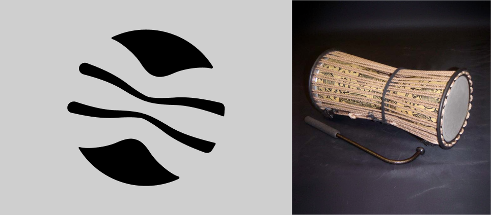
The Gangan logo centers on the silhouette of a gángan, the Yoruba talking drum. The form is recognizable to anyone familiar with West African percussion: the hourglass shape, the tension cords along the sides, the stretched skin at both ends. The silhouette is reduced to its essential geometry. Clean curves. No unnecessary detail. A drum that reads as a drum at any scale.
The wordmark sits alongside the symbol in a clean, modern typeface. The relationship is balanced; neither the symbol nor the text dominates. They work as a single lockup or independently.
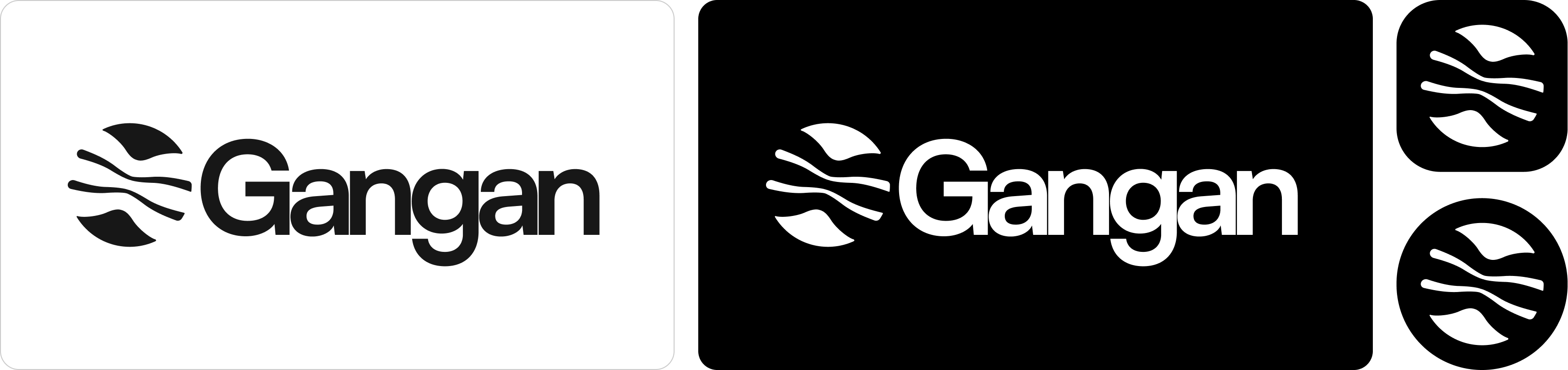
The logo ships in three configurations:
- Full lockup: symbol plus wordmark, for website headers and primary brand placement
- Horizontal lockup: symbol and wordmark side by side, for navigation bars and tight spaces
- Standalone symbol: the drum silhouette extracted for app icons, favicons, and social avatars
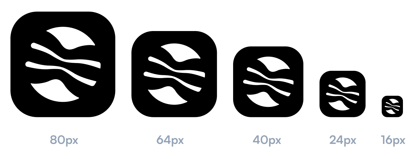
Each configuration was tested at app-icon scale (64×64px), website-header scale, and social-template scale. The drum silhouette remains recognizable at 16×16px. The full lockup holds its character down to 80px wide.
Color Palette
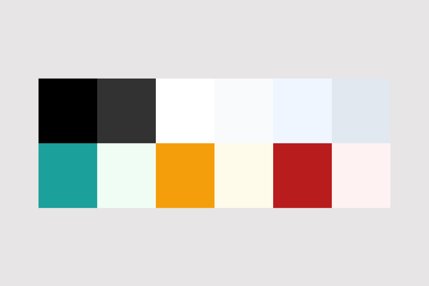
The palette is deliberately monochrome: black and white, with a short ramp of near-blacks and off-whites in between. There’s no signature brand hue, and that’s the point. Gangan is a canvas for music, so the color comes from the work itself: album art and artist photography carry the vibrancy while the interface stays out of the way. A neutral, high-contrast system lets the imagery be the loudest thing on screen.
The only systematic color lives in the status palette: green for success, amber for warnings, and red for errors, each paired with a soft tint for backgrounds and surfaces. These aren’t brand accents; they’re functional signals, used only where the interface needs to communicate state. Everything else is grayscale.
Black on white (and white on black) clears WCAG AAA with room to spare. The system is built light- and dark-mode-first from the same tokens: invert the monochrome ramp and the identity still holds, because it never leaned on a single color to carry it.
Typography
The wordmark uses a clean, modern sans-serif, geometric in structure, with even stroke weights and open apertures. It complements the drum symbol without competing. The typeface is chosen for readability across the product UI, not just the logo lockup.
For the product itself, the system uses a single sans-serif type family across all four platforms. One weight scale. One line-height rhythm. The reading experience for lyrics, artist bios, and tier descriptions is consistent from a 5-inch phone screen to a 27-inch desktop monitor.
Applications
App store assets
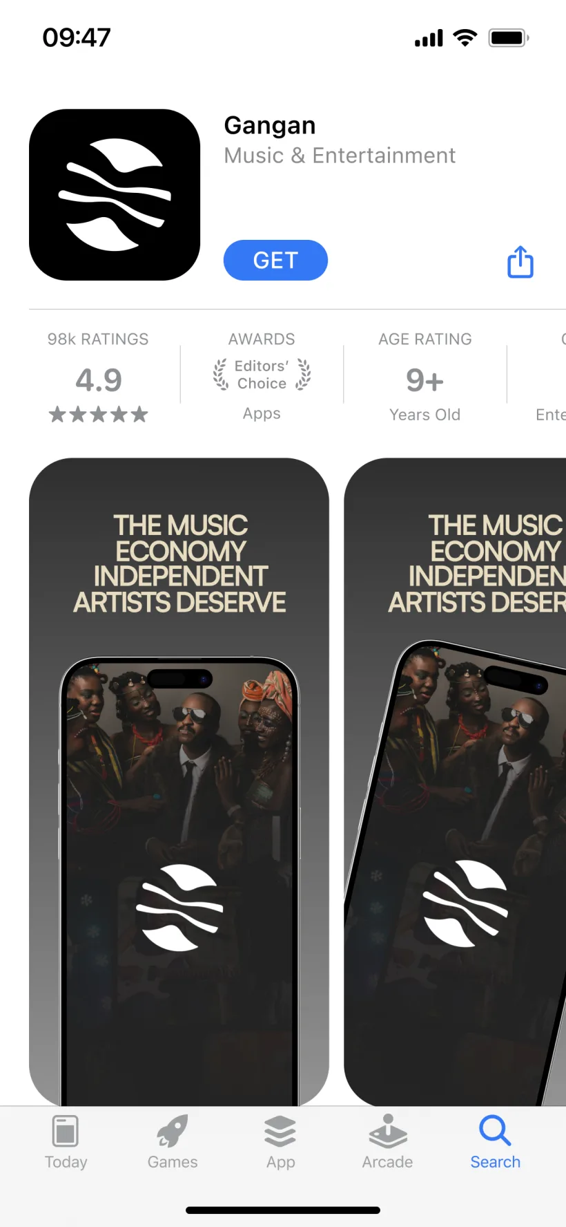
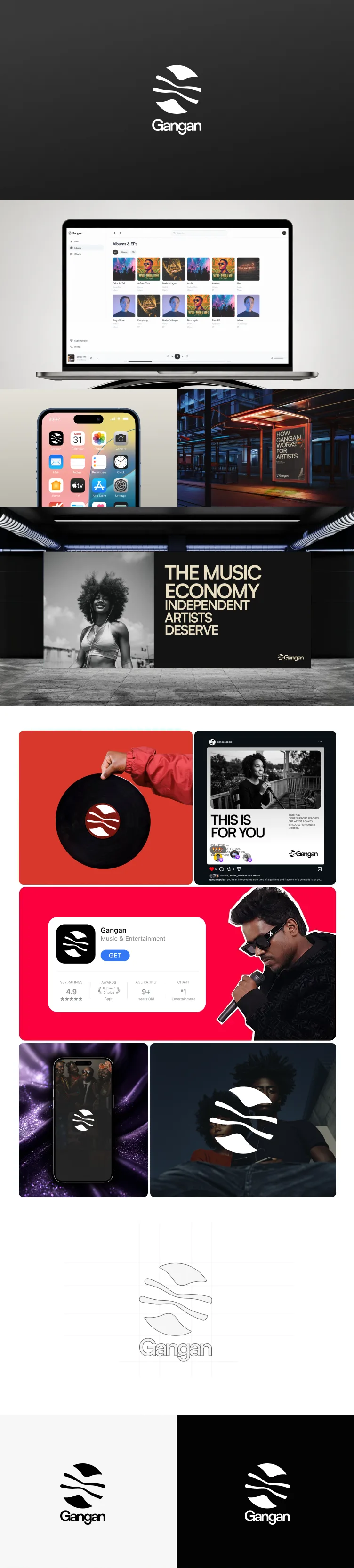
App store screenshots were designed to communicate the product’s core value in a single scroll: artists get paid directly, fans get early access, no algorithm in between. Each screenshot pairs a feature (tiers, earnings, library, player) with a one-line value proposition. The dark background makes the UI screens pop against the App Store and Play Store’s white browsing contexts.
Social templates
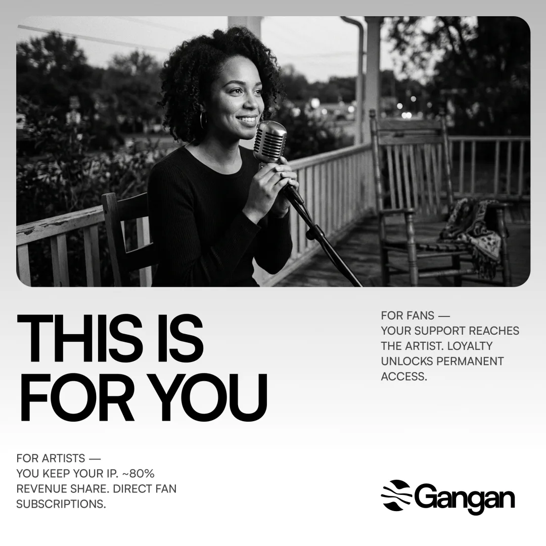
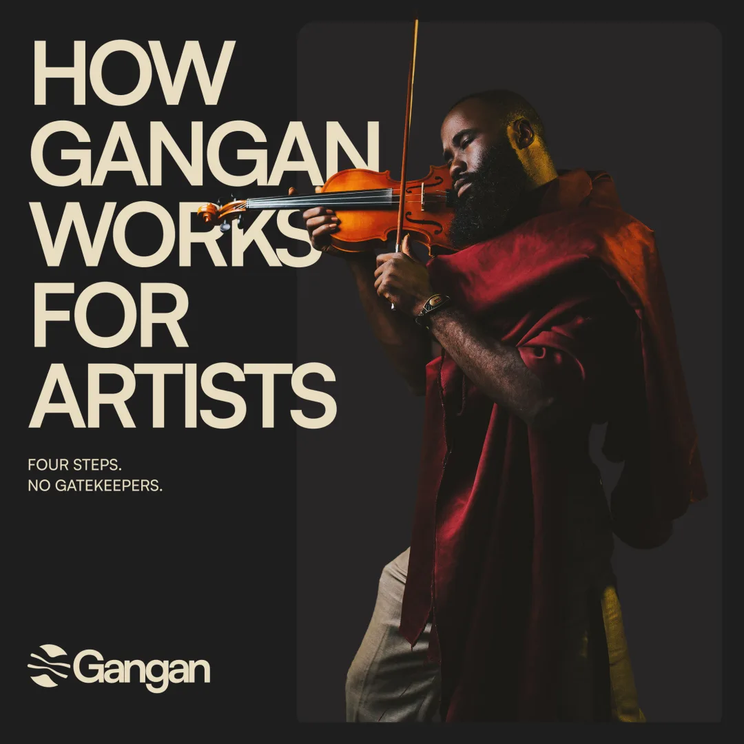
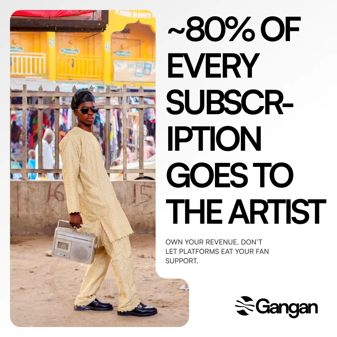
Launch templates extend the identity beyond the product. Each is built from the same monochrome system: oversized type, the drum symbol, black-and-white as the default state. The only color comes from the artist photography itself, so the imagery stays the loudest thing in a noisy feed while the brand frame holds steady around it.
The system is modular: swap the headline, the body line, and the background image, and the layout still holds. One person can produce a full launch run in an afternoon without breaking brand consistency; the template does the heavy lifting.
Website
The marketing site at gangan.app uses the full lockup as its primary brand signal. A high-contrast monochrome canvas fills the viewport, the same black-and-white system as the rest of the identity. Scrolling sections alternate between brand messaging and product screenshots, where album art and UI supply the only color. The identity system (logo, colors, typography, spacing) propagates from Figma to Webflow with zero translation loss.
Result
Gangan launched in May 2026 with a cohesive visual identity across all four platforms and marketing surfaces. The drum mark appears on the App Store and Google Play Store, the marketing website, social media, and inside the product itself, as an app icon, a loading screen, and a navigation brand mark.
The identity does what it was designed to do: it signals “different” at a glance. No green. No red. No algorithm. A talking drum.