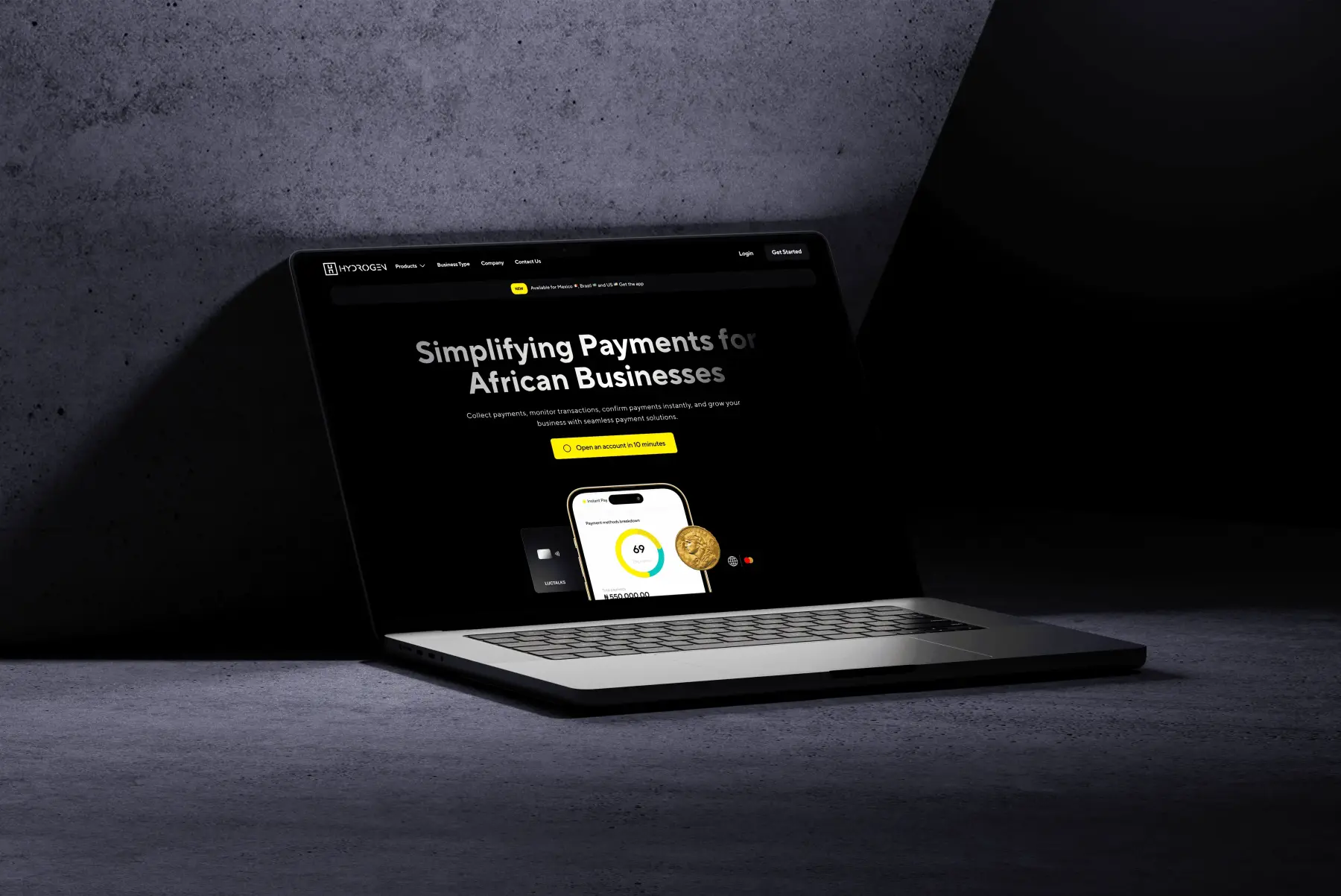
Case Study · 2024
Poseidon Design System
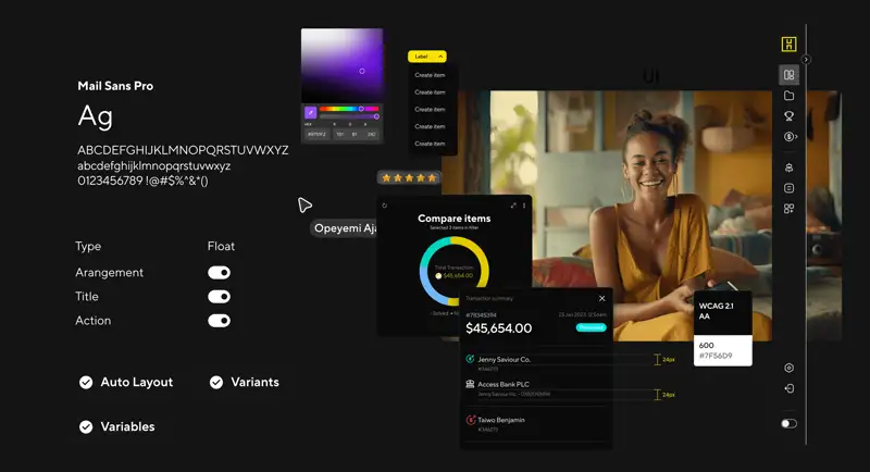
A unified design system that ended fragmented UX across 5 fintech products, 120+ components, WCAG 2.1 AA, and −35% design-to-dev handoff time.
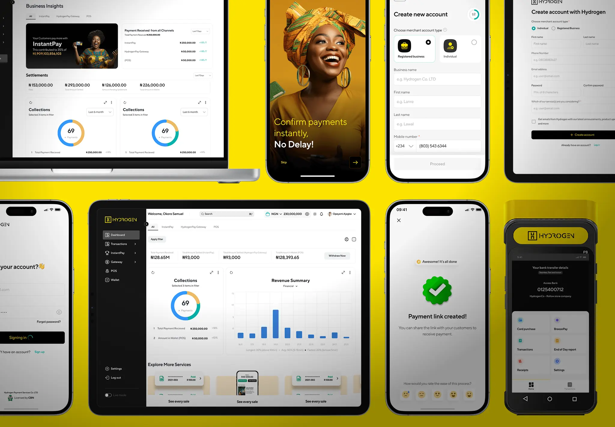
−35% design-to-dev handoff time · 120+ components · WCAG 2.1 AA · SUS 62 → 78
The Problem
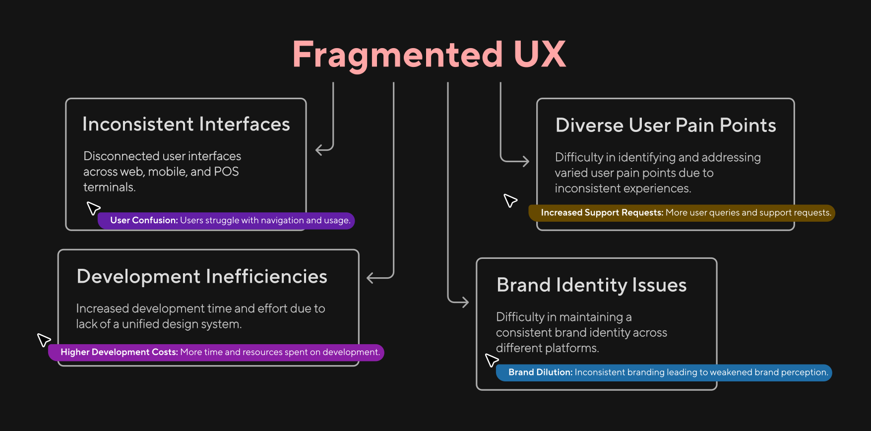
HydrogenPay had five products running across web, mobile POS, merchant dashboard, API portal, and admin console, and they looked like five different companies built them.
User testing surfaced the damage: customers moving between the mobile app and the merchant dashboard couldn’t find the same features in the same places. Buttons that meant “confirm payment” on one screen said “proceed” on another. Color, spacing, interaction patterns. Nothing transferred. Support tickets tagged “confusion” had tripled in six months.
The root cause wasn’t talent. Every product squad had good designers and good developers. They just had no shared language. Every team started from a blank Figma file. Every developer built their own button component. Five teams, five implementations of the same thing.
My role: Lead Product Designer. I led a team of 5 designers and coordinated with 2 front-end developers, working across all five product squads to build Poseidon, HydrogenPay’s first design system.
The Bet
Most companies approach a design system as a library. Ship a button, ship a modal, call it done. We knew that wouldn’t work here; the fragmentation was too deep. If developers had to opt-in to every component, they wouldn’t. The system had to make the right thing the easy thing.
We set three principles before writing a single line of code:
1. Adoption is the product. A component nobody uses is a wasted sprint. Every decision (naming, documentation, API surface) was optimized for developer uptake, not design purity.
2. Accessibility is infrastructure, not a checklist. WCAG 2.1 AA wasn’t a post-launch audit. Color contrast ratios (≥4.5:1), keyboard navigation, and screen reader labels were baked into the design tokens themselves. If you used Poseidon tokens, you got accessibility for free.
3. Consistency ships faster than creativity. For 80% of UI needs, one pattern wins. We saved custom work for the 20% where it actually mattered.
The Process
Audit: Counting the damage
We catalogued every UI element across all five products. The numbers were worse than anyone guessed:
- 14 different button styles across products: same action, different visual
- 0 shared font scale: products used anywhere from 12px to 18px body text
- 3 different color systems: one team used hex, another used HSL, the third named colors like “primaryBlue” (which wasn’t blue on dark mode)
- Zero shared components: five teams, five button components in five codebases
I ran a stakeholder workshop where I put all five product dashboards side-by-side on a single screen. The room went quiet for about ten seconds. That was the moment we got buy-in.
Build: Atomic, but pragmatic
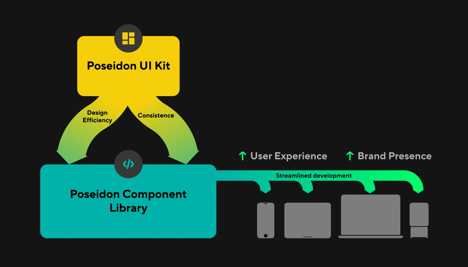
We adopted Brad Frost’s Atomic Design methodology: atoms (tokens, icons), molecules (inputs, badges), organisms (nav bars, data tables). But with a rule: every component had to ship with a real use case from a real product. No speculative components. If nobody needed a date-range picker today, we didn’t build one.
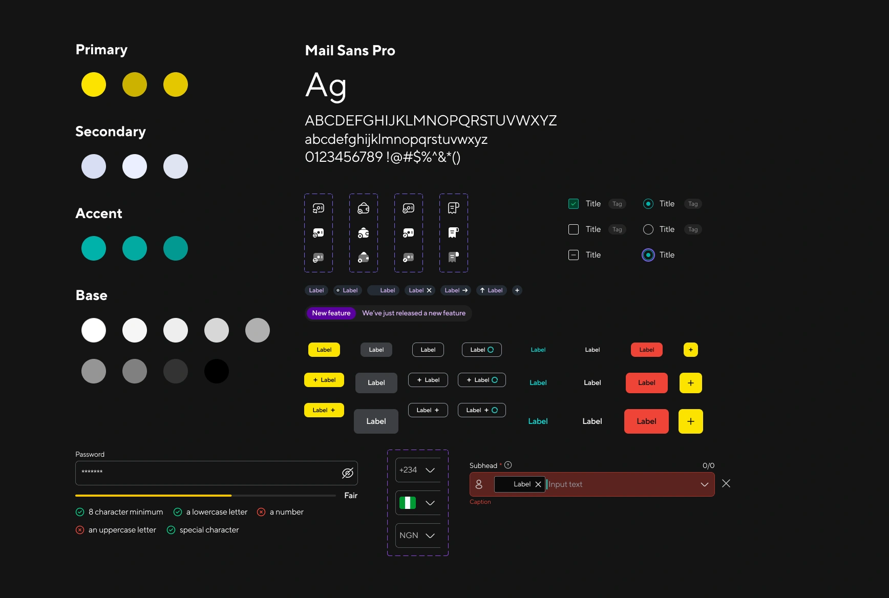
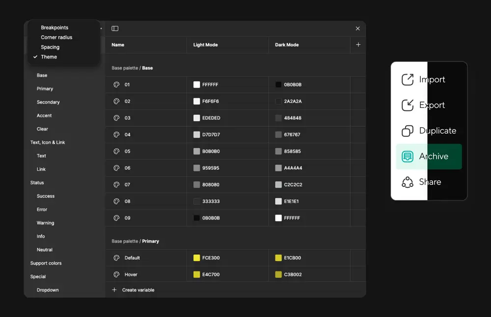
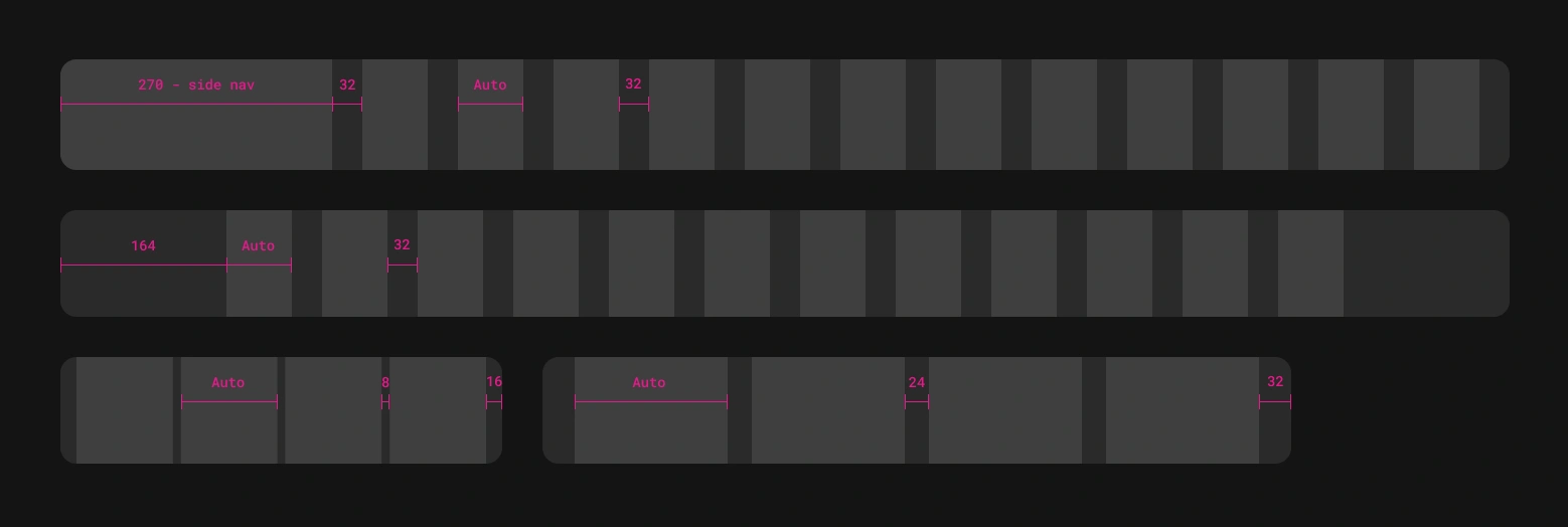
Design tokens handled spacing (4px scale), typography (modular type scale, 2 families max), and color: semantic tokens (never raw hex in production code). The token layer meant designers and developers referenced the same source of truth. A spacing change in Figma updated everywhere.
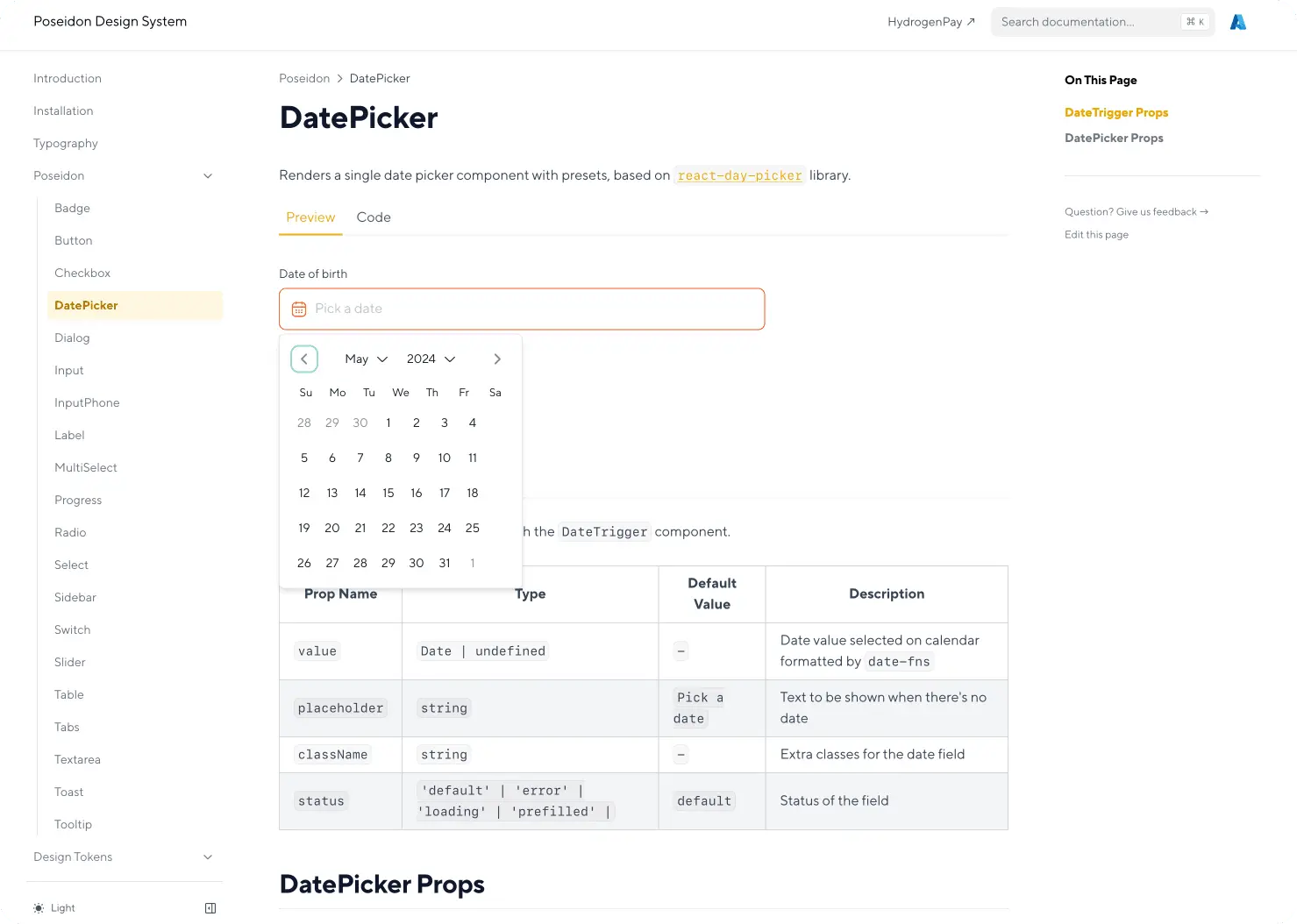
Our 2 front-end developers built the component library in Storybook, working directly from Figma specs. Designers reviewed components in Storybook, not just in mockups. That closed the gap between what we designed and what actually shipped.
The thing that failed (and what we learned)
Early on, we tried to retroactively style-match existing product screens to the new Poseidon components. The idea was to ease the transition: update the CSS, keep the layout, minimize disruption.
It was a disaster.
The hybrid screens looked wrong. Old spacing quirks butted against new component padding. Some pages had two visual languages on the same screen. Users reported the “updated” pages felt less trustworthy than before. One merchant dashboard page generated more confusion tickets in two weeks than it had in the previous two months.
We killed the approach. Pivoted to a “greenfield screens first, then full-page migrations” strategy. Every new feature shipped with Poseidon components from day one. Existing screens migrated one full page at a time: never half a page. It added three weeks to the rollout timeline, but every migration after that was seamless.
The lesson: half-migrated is worse than not migrated. Users trust consistency more than they trust “new.” If you can’t migrate a screen entirely, don’t touch it until you can.
The Outcomes
Developer velocity: −35% handoff time
Before Poseidon, a typical component spec from Figma to production took a designer writing redlines, a developer interpreting them, and typically two rounds of QA catching spacing and color mismatches. After tokens and Storybook, the developer pulled the component directly; the spacing, color, and interaction states were already correct. Handoff time dropped by 35% across all active product squads.
Consistency: −60% UI inconsistency bugs
Post-launch, the QA team tracked a category called “UI inconsistency bugs”: mismatched button styles, wrong font sizes, off-brand colors. Within three months of adoption, that category dropped 60%. The bugs that remained were mostly in the one product still migrating.
Accessibility: compliance by default
All 120+ components met WCAG 2.1 AA out of the box. Color contrast (≥4.5:1 for body text, ≥3:1 for large text and UI elements) was enforced at the design token level. Keyboard navigation and screen reader labels shipped with every interactive component. No product team had to think about accessibility separately; it was infrastructure.
User satisfaction: SUS 62 → 78
We measured System Usability Scale scores before and after migration across the first three products that adopted Poseidon. The baseline was 62 (below the industry average of 68). After migration: 78, pushing into “excellent” territory. Users specifically cited “things work the same way now” and “I don’t have to relearn each screen.”
Adoption: 4 of 5 products within 6 months
The merchant dashboard, mobile POS, API portal, and admin console adopted Poseidon within six months of launch. The fifth product (the legacy web dashboard) was the largest codebase and the one we’d attempted and abandoned the style-matching approach on. Its migration completed four months later, using the full-page strategy we should have chosen from the start.
What I’d Do Differently
Start with the hardest migration first. We picked the easiest product as our pilot. It went smoothly and gave us false confidence. The legacy web dashboard was always going to be the hard one, and by leaving it for last, we carried its fragmentation the longest. I’d reverse the order next time: tackle the hardest migration early, learn the real edge cases, and let the easy ones fly through afterwards.
Invest in component documentation before, not after, developer onboarding. We shipped components with minimal docs, intending to flesh them out later. Developers hesitated to adopt components they didn’t fully understand. In retrospect, documentation is a launch blocker, not a v1.1 feature.
Fight harder for dedicated engineering capacity. Two developers across five product squads meant we were always resource-constrained. The system shipped, but at times design was weeks ahead of development. For a project this scale, I’d advocate for a dedicated design-system engineering team from day one, not shared resources borrowed from product squads.
Poseidon taught me that a design system isn’t a Figma library. It’s an organizational intervention. The components matter less than the shared language. The tokens matter less than the trust that comes from opening two products and knowing they belong to the same company. Everything else is implementation detail.