July 7, 2026
Five Seconds Before They Read a Word
Users don't start with your copy. They start with a feeling. And that feeling is decided before conscious thought kicks in.

I was reviewing a junior designer’s portfolio last month. Before I could form a single thought about their work, I had already decided something about them. Not about the quality. Not about the craft. Something more primitive. Something that happened in the first three seconds of the page loading.
I felt tense. The layout was crowded, everything shouting at once. Four different typefaces fought each other. A neon green hover state on a lime background. My shoulders tightened before my brain could say “contrast ratio.”
The work itself was solid. Genuinely solid. But the wrapper was so aggressive that I never arrived at the work with clear eyes. I arrived already defensive.
This isn’t a portfolio problem. It’s a design problem that lives in every interface, every landing page, every onboarding flow, every product we ship. And most of us never design for it because we’re too busy designing for what happens after someone decides to care.
The poster on the wall
I watched a design talk recently where the speaker made a point that rewired how I think about this. He described two versions of a poster for the same product.
Version one was loud. Bold colors competing for attention. Multiple type treatments. Information crammed into every corner because “we have a lot to say and people might miss something.”
Version two said the same thing with different emotional intent. Softer palette. Breathing room. One clear focal point. The same product. The same information. Completely different invitation.
The difference wasn’t in what the poster said. It was in what the poster made you feel before you read anything. Fear of missing out versus calm curiosity. Urgency versus trust. “Buy this now or you’ll regret it” versus “you’re safe here, take your time.”
Same product. Same facts. Opposite emotional contract.
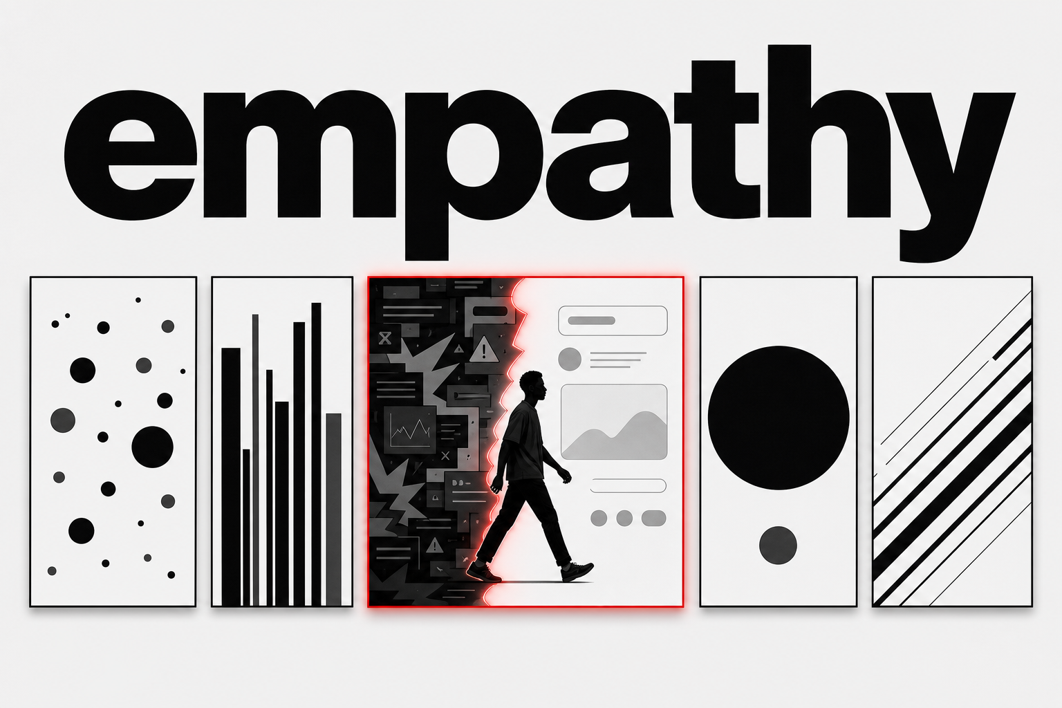
The speaker called this predictive empathy: designing for the emotional state someone will be in five seconds from now, before they’ve processed a single word of your copy, before they’ve decided whether to scroll, before conscious evaluation begins. Because by the time evaluation starts, the feeling has already been decided.
Most designers I know don’t ask this question. They ask “does this look good” or “is this usable” or “does this communicate the right information.” All legitimate. All downstream from the question that actually matters first.
What will they feel before they think?
The gap between what you mean and what lands
There’s a gap between what you intend and what your audience actually experiences. The speaker described it as a perception gap, and designers tend to be blind to it because we know too much. We know the intent behind every decision. We know why that button is red and that spacing is tight and that section is above the fold. The user doesn’t. The user meets your interface cold, with no briefing, no context, no “here’s what we were going for.”
If you don’t close that gap deliberately, the gap gets filled. Filled with assumptions. Filled with whatever emotional state the user walked in with. Filled with the accumulated baggage of every other interface that looked vaguely like yours.
Red means error unless you establish it doesn’t. Tight spacing means cheap unless you prove otherwise. Animation means playful unless the context says serious. Every visual decision you make is being interpreted emotionally before it’s interpreted functionally, and if you’re not designing for that sequence, you’re leaving your work to chance.
Three questions I’ve started asking
After watching that talk, I started running every design decision through three questions. Not during the polish phase. During the first wireframe. Before color. Before type. Before anything that looks like a real screen.
One: what emotional state is someone in when they arrive here? If they’re coming from a Google search at 11pm, tired and impatient, your interface needs to feel like relief, not another demand. If they’re coming from a referral, pre-warmed and curious, your interface needs to reward that curiosity with clarity, not test it with friction.
Two: what do I want them to feel in the first five seconds? Not “what do I want them to know.” Knowledge comes later. First comes the feeling that makes knowledge possible. Safe enough to explore. Curious enough to scroll. Confident enough to act.
Three: does every element on this screen earn its place in those five seconds? If something creates noise that delays the target feeling, cut it. Even if it’s useful later. Even if it tested well in isolation. The five-second emotional window is more expensive than any single feature.
The third question is the hardest. I’ve killed elegant animations because they made the page feel busy instead of calm. I’ve removed secondary CTAs because they introduced choice at a moment where choice wasn’t the point. I’ve stripped sections that stakeholders loved because they added cognitive weight without adding emotional clarity.
None of these were bad features. They were just bad for the first five seconds.
What this costs when you skip it
I’ve watched products with excellent core functionality fail to convert because the landing page felt untrustworthy. Not looked untrustworthy. Felt untrustworthy. The difference matters.
Untrustworthy-looking is a visual critique. Wrong color palette, outdated type, clip art where photography should be. Those are fixable. Untrustworthy-feeling is deeper. It’s the vague unease of too many things happening at once. The subtle anxiety of inconsistent spacing that your eye catches before your brain registers. The quiet wrongness of a layout that doesn’t breathe.
Users don’t articulate this. They bounce. They say “I don’t know, it just didn’t feel right” and click away. Your analytics show a drop-off and you A/B test the button color because that’s what you can measure. But the real problem happened in the first four seconds, before the button was even in view.
The cost isn’t just conversion. Designers who don’t practice predictive empathy produce work that is technically correct and emotionally empty. It checks all the functional boxes. It’s accessible and consistent and grid-aligned. And nobody cares about it, because the person who was supposed to care never got past the emotional gate.
The contradiction
Here’s where I struggle with this framework, and I should be honest about that.
There is a point where designing for emotional response becomes designing for emotional manipulation. Dark patterns use emotional prediction too. Scarcity timers. Social proof counters. “Only 2 rooms left” when the hotel has fifty vacancies. These are not design failures. They are predictive empathy weaponized. They know exactly what you’ll feel in the first five seconds: urgency, fear of missing out, social pressure. And they optimize for conversion, not for you.
I don’t have a clean line between empathy and manipulation. Nobody does. But I know the difference shows up in the question you ask yourself. “What will make them act” is a different question from “what will make them feel safe enough to make their own decision.” One closes doors. The other opens them.
Predictive empathy used well is about removing barriers to clarity. It’s about designing the emotional container so the content inside can be judged on its merits. It’s the design equivalent of a good host: someone who makes you comfortable not so they can sell you something, but so you can be present enough to decide what you actually want.
Try this next time you open Figma
Before you place your first frame, close your eyes and imagine someone seeing your screen for the first time. Not your PM. Not your design lead. A stranger. Someone tired, distracted, and skeptical. They don’t owe you their attention. They don’t know what problem you’re solving. They aren’t impressed by your craft yet.
What do they feel in the first five seconds?
If the answer is anything other than what you intended, you have work to do before the pixels matter.
The layout, the type, the interactions, the copy. Those come after. First, decide what room you’re inviting someone into. Because they’ll feel the room long before they read the sign on the door.