July 10, 2026
Designing for a Canvas You Don't Control
I've spent months building a design system with 93 tokens. My next product ships in 14pt system font. And I think it's making me a better designer.

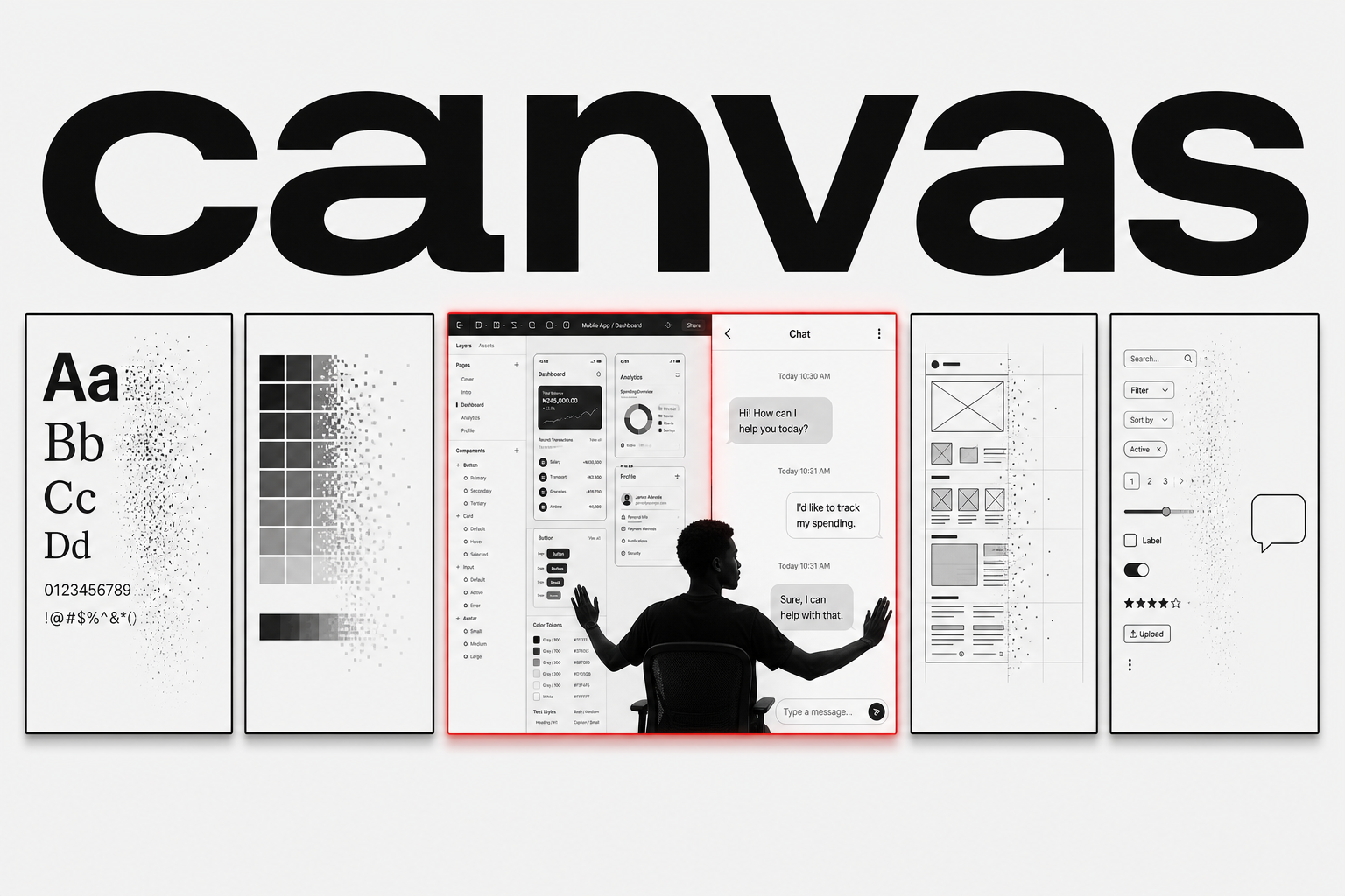
I have a design system in Figma right now with ninety-three variables. Every color bound to a semantic token. Ten text styles, each with a named role and a defined purpose. Eleven components, fully auto-laid out, every variant mapped to a design decision. Months of craft, all organized around the idea that control is the point. That the more precisely I define the system, the better the output.
Three tabs over, I’m designing a WhatsApp bot.
It has one font. I don’t get to choose it. It has one text size. I don’t get to set it. There are no color tokens because there is no color. There is no layout grid because there is no layout. The canvas is a chat bubble and my design tools are: text, inline buttons, and sequence.
If someone had told me two years ago that my most interesting design work in 2026 would render in a system font on a messaging app, I would have laughed. But here I am. And I think it’s making me better at my job.
What gets stripped away
When you design for WhatsApp or Telegram, the first thing you notice is everything you can’t use.
No typography. You get whatever font the platform gives you. On WhatsApp, that’s whatever the user’s phone defaults to. On Telegram, it’s the app’s system font. You can’t set weight. You can’t set size. You can’t set line height. The platform decides.
No color. Your text is black or white depending on the user’s theme. Your bubbles are green, gray, or blue depending on the platform and the sender. You don’t pick these. They are not yours to brand.
No layout. You don’t control spacing between elements. You don’t control alignment. You don’t control the width of the container or the padding around your content. The chat feed is a single-column stream and you get one slot in the timeline.
No interactivity beyond three things: text input, inline buttons, and command shortcuts. No hover states. No transitions. No micro-interactions. No loading skeletons. If something takes time, you type “give me a moment” and hope they wait.
No visual hierarchy in the way we’re trained to think about it. You can’t make the heading bigger because there is no heading. You can’t use color to draw the eye because there is no color. You can’t create a focal point with negative space because the platform fills the space for you.
What remains, after all of that, is two things: words and sequence. What you say, and what order you say it in.
What that teaches you
When you can’t rely on visual craft, you discover very quickly whether you actually know how to design. Not decorate. Design.
A chat interface doesn’t let you hide behind a beautiful layout. If the flow is confusing, the user gets confused. There’s no visual landmark to orient them. No breadcrumb. No sidebar. Just the last few messages in the thread and an input field at the bottom. If they don’t know what to type next, you’ve lost them. Not in a “bounce rate” analytics way. In a “they close the chat and never come back” way.
This forces a kind of clarity that visual design sometimes papers over. On a web page, you can have three CTAs and a hero image and a testimonial carousel and a footer with twenty links, and the visual hierarchy makes it feel organized. In a chat, if you send three buttons and a paragraph of text in one message, it feels like noise. Because it is noise. You just can’t see the noise when it’s spread across a 1440px canvas with proper spacing.
Designing for chat teaches you that most of what you put in an interface is filler. Not because the filler is bad. Because it’s defensive. You add explanatory text because you’re not confident the flow is clear. You add secondary actions because you’re not sure which one the user wants. You add branding because you’re worried they’ll forget who built this. In a chat interface, defensive design collapses. You don’t have room. You have to be right about what matters.
The constraint doesn’t make the design worse. It makes the thinking better. You can’t ship a confused flow and count on the layout to bail you out. The flow IS the product.
The designer who can do both
I’m not arguing that chat interfaces are superior to web apps. That’s not the point. I’m arguing that the designer who can work in both modes, who can shift from ninety-three design tokens to zero, is a sharper designer in both.
When I go back to designing a dashboard after working on a Telegram bot, I see the dashboard differently. I notice the filler. I see the paragraphs of text that nobody reads. I spot the buttons that exist because someone asked for them in a meeting, not because a user needs them. The chat work has sharpened my eye for what’s actually doing work versus what’s just occupying space.
The reverse is also true. When I go back to the bot after a day in Figma, I bring something with me. I think about consistency across messages the way I think about consistency across screens. I treat the bot’s language as a design system: consistent tone, consistent phrasing, consistent expectations. The words become the tokens. The tone of voice becomes the style guide. The command structure becomes the information architecture.
Neither mode replaces the other. They sharpen each other.
The Nigerian context
There’s a reason this is happening here and not in San Francisco.
In Nigeria, WhatsApp is not a messaging app. It’s the operating system. It’s where businesses send invoices. Where churches stream services. Where landlords collect rent. Where customer support happens. Where sales happen. People don’t “go online.” They open WhatsApp. They already live there.
Telegram has carved out a different slice: communities, automated workflows, power users. The people running logistics operations, tracking inventory, managing teams across cities. They’re on Telegram because channels and bots give them tools that WhatsApp doesn’t. Together, the two platforms cover almost every business interaction that doesn’t require a specialized web app.
This isn’t a compromise. It’s a design decision based on reality. The average Nigerian smartphone has limited storage. App downloads cost data. Trust in new apps is low because fraud is high. But WhatsApp came pre-installed and Telegram was recommended by someone they trust. The barrier to entry is zero because the user is already inside.
Designing for this context isn’t designing down. It’s designing for where people actually are.
Try it
Next time you’re stuck on a screen in Figma, open WhatsApp. Design the same flow as a chat conversation. You, the user, the bot. No visuals. No layout. Just messages and responses and buttons.
Pay attention to where the user gets confused. Pay attention to where you want to add a paragraph of explanation because the flow isn’t clear. Pay attention to how much you’re relying on visual hierarchy to do the work that the flow should be doing.
It’s uncomfortable. You’ll feel naked without your tokens. But that’s the point. The tokens are there to support the design, not to be the design. If the flow doesn’t work in plain text, it doesn’t work.
The most useful design exercise I’ve done this year didn’t happen in Figma. It happened in a chat window. With one font. Zero tokens. And nowhere to hide.